The Mocha Nut Coffee Shop
The Mocha Nut Coffee Shop
The Mocha Nut Coffee Shop
A mobile application for a local coffee shop
A mobile application for a local coffee shop
A mobile application for a local coffee shop
overview
overview
How to streamline the coffee ordering process?
How to streamline the coffee ordering process?
Disclaimer
Disclaimer
Disclaimer
This is a hypothetical case study I completed to personally gain more experience. I have no affiliation with the Mocha Nut Coffee Shop brand.
Background, what exactly does Nora AI Mock Interviewer and why is this important for other students to have this as a learning tool, basically just a general background on why you did this in the first place, how does it help the world.
This is a hypothetical case study I completed to personally gain more experience. I have no affiliation with the Mocha Nut Coffee Shop brand.
Background
Background
The Mocha Nut Coffee Shop App is a digital way for customers to order their pastries in advance online. The application is connected to the Mocha Nut Coffee shop's one location and has an overall cozy feel.
The Mocha Nut Coffee Shop App is a digital way for customers to order their pastries in advance online. The application is connected to the Mocha Nut Coffee shop's one location and has an overall cozy feel.
The Problem
The Problem
The Problem
The app is confusing, and it is difficult for the average consumer to make a complete coffee order. From confusing UI to buttons that serve no function, there are a couple hiccups in the design.
The app is confusing, and it is difficult for the average consumer to make a complete coffee order. From confusing UI to buttons that serve no function, there are a couple hiccups in the design.
The app is confusing, and it is difficult for the average consumer to make a complete coffee order. From confusing UI to buttons that serve no function, there are a couple hiccups in the design.
The Solution
The Solution
The Solution
I simplified the coffee shops design, shortening the coffee ordering process. Additionally, I added some extra screens such as order confirmation.
I simplified the coffee shops design, shortening the coffee ordering process. Additionally, I added some extra screens such as order confirmation.
I simplified the coffee shops design, shortening the coffee ordering process. Additionally, I added some extra screens such as order confirmation.
Project Type
Project Type
Project Type
UI/UX Design
UI/UX Design
UI/UX Design
My Role
My Role
My Role
User Research
Wireframing
Prototyping
User Research
Wireframing
Prototyping
User Research
Wireframing
Prototyping
Timeline
Timeline
Timeline
Nov 2023-Jan 2024
(3 months)
Nov 2023-Jan 2024
(3 months)
Nov 2023-Jan 2024
(3 months)
Tools
Tools
Tools
Figma
Figjam
Figma
Figjam
Figma
Figjam

research
research
First off, let's hear it from the users
First off, let's hear it from the users
My goal with this user research was to find out exactly what confuses people with the original UI, and whether I need to focus more on aesthetics and branding or functionality and accessibility. I conducted a series of user interviews and usability tests, and used that feedback to create affinity maps and narrow down my main edits I needed to make.
My goal with this user research was to find out exactly what confuses people with the original UI, and whether I need to focus more on aesthetics and branding or functionality and accessibility. I conducted a series of user interviews and usability tests, and used that feedback to create affinity maps and narrow down my main edits I needed to make.
My goal with this user research was to find out exactly what confuses people with the original UI, and whether I need to focus more on aesthetics and branding or functionality and accessibility. I conducted a series of user interviews and usability tests, and used that feedback to create affinity maps and narrow down my main edits I needed to make.
Affinity Mapping
Affinity Mapping
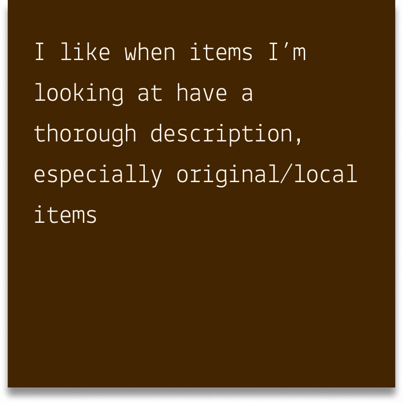
Clear descriptions of menu items
Clear descriptions of menu items
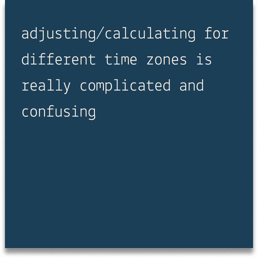
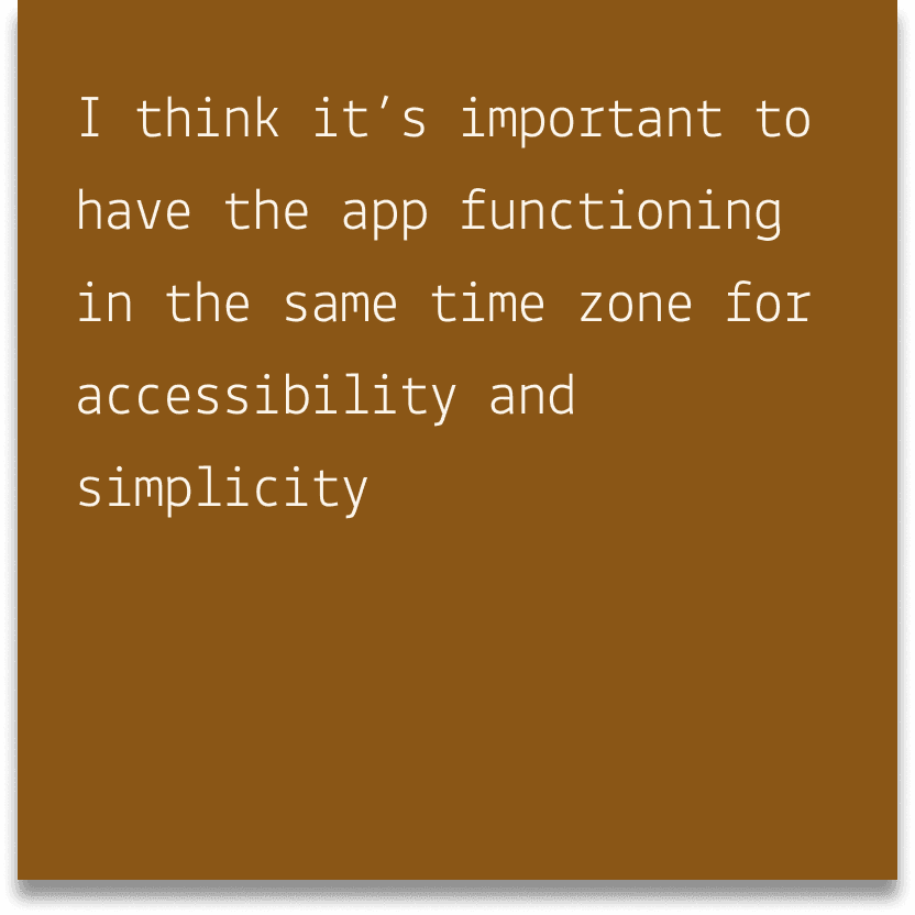
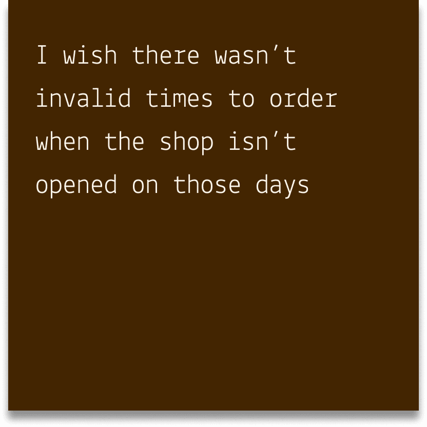
Timezone Conversion Issues
Timezone Conversion Issues
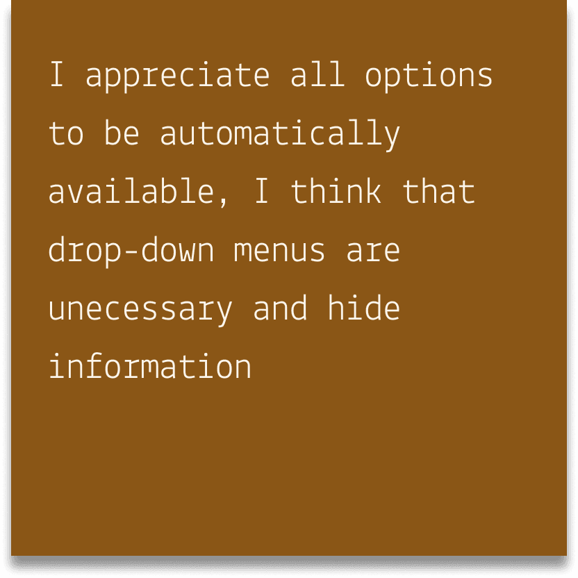
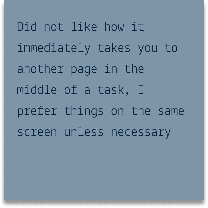
Too many dropdowns/screens
Too many dropdowns/screens
Affinity Mapping
Clear descriptions of menu items
Timezone Conversion Issues
Too many dropdowns/screens

low-fidelity
low-fidelity
How do I simplify the app while maintaining the shop's branding?
How do I simplify the app while maintaining the shop's branding?
Roadmap
Roadmap
Roadmap
To implement the user feedback I got from my research, I'm planning on simplifying the menus so that there are fewer screens and the user experience is more accessible.
To implement the user feedback I got from my research, I'm planning on simplifying the menus so that there are fewer screens and the user experience is more accessible.
To implement the user feedback I got from my research, I'm planning on simplifying the menus so that there are fewer screens and the user experience is more accessible.
Iterate
Iterate
Testing out my Design: See if the users like this first
Testing out my Design: See if the users like this first
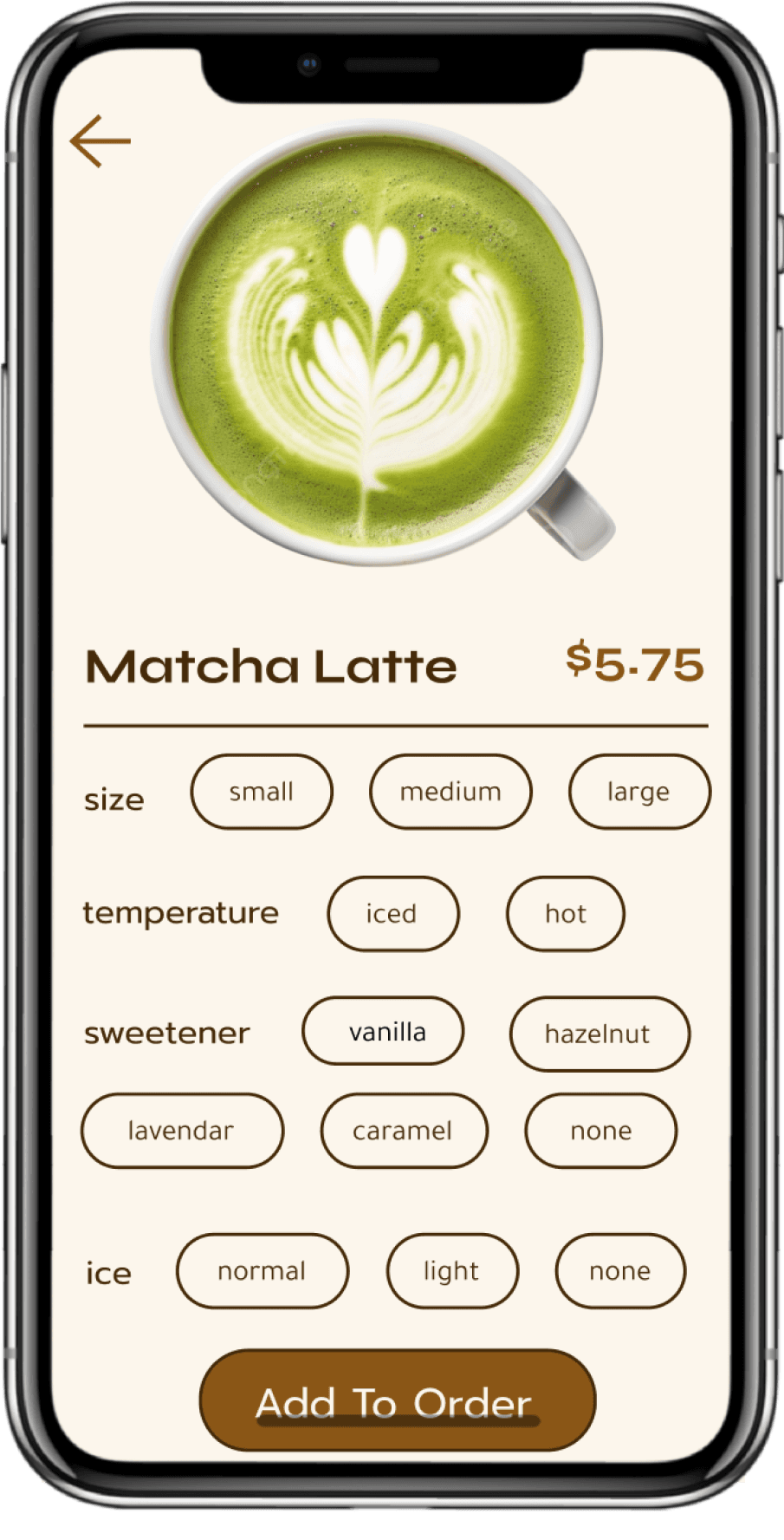
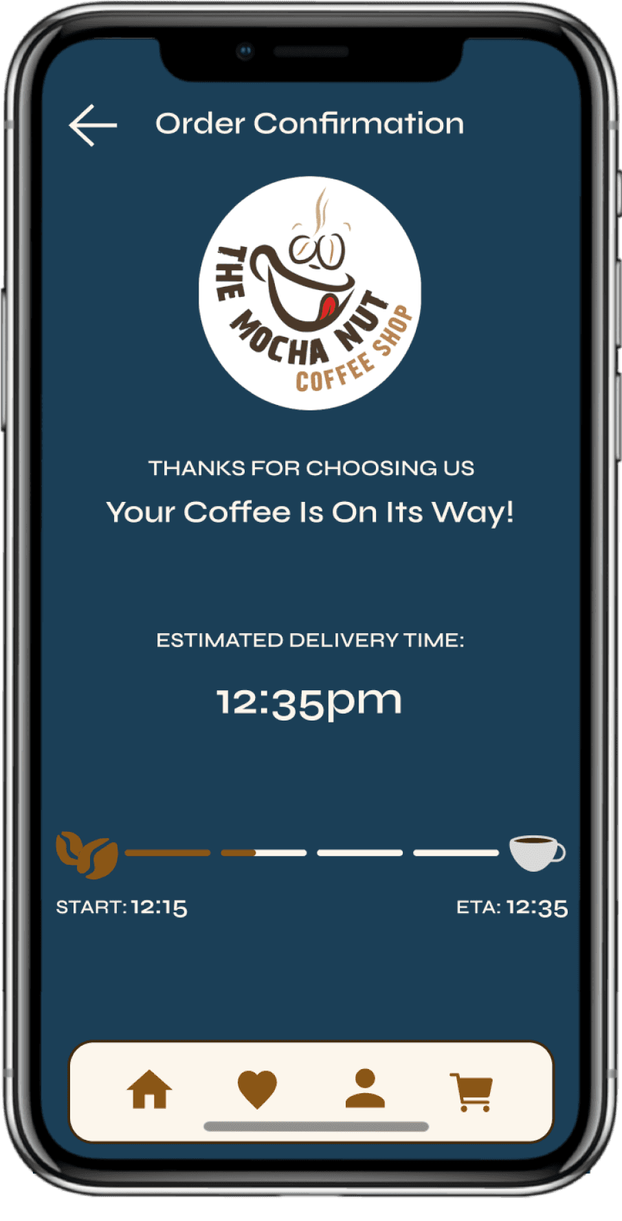
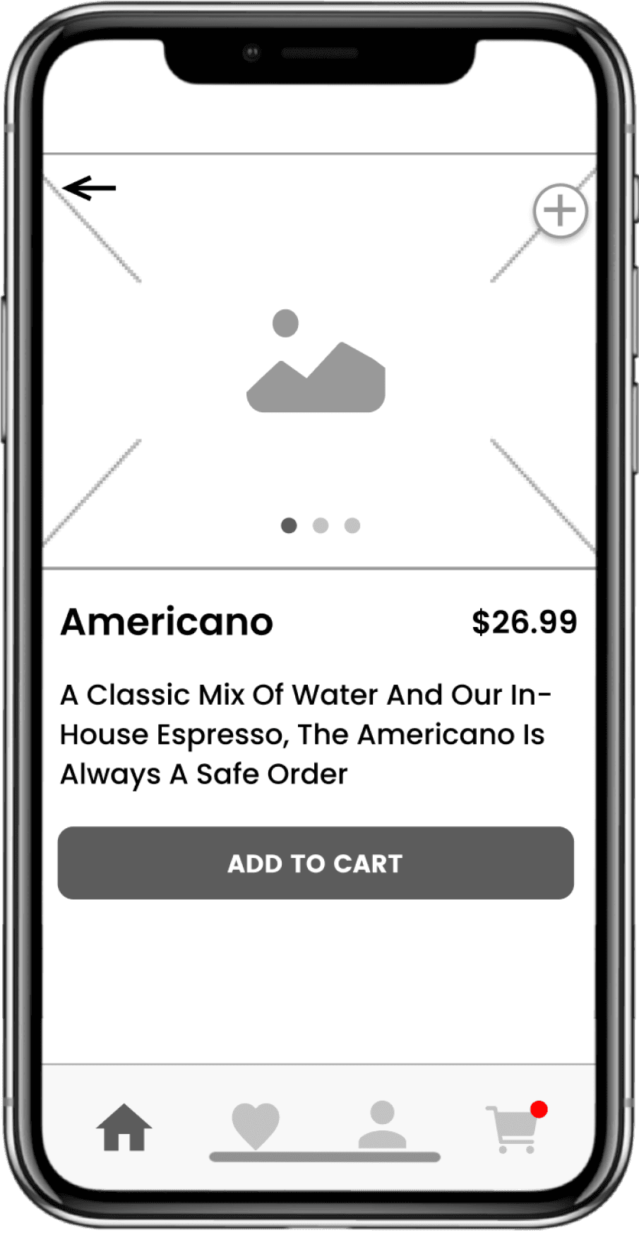
My Changes
My Changes
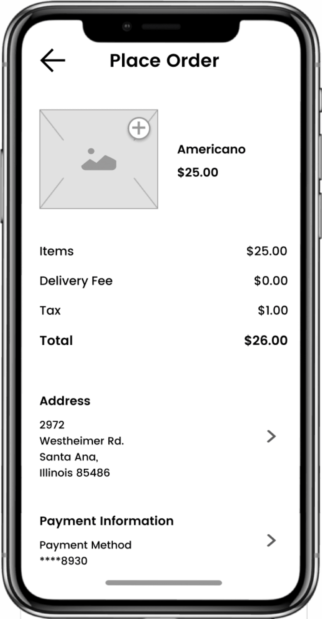
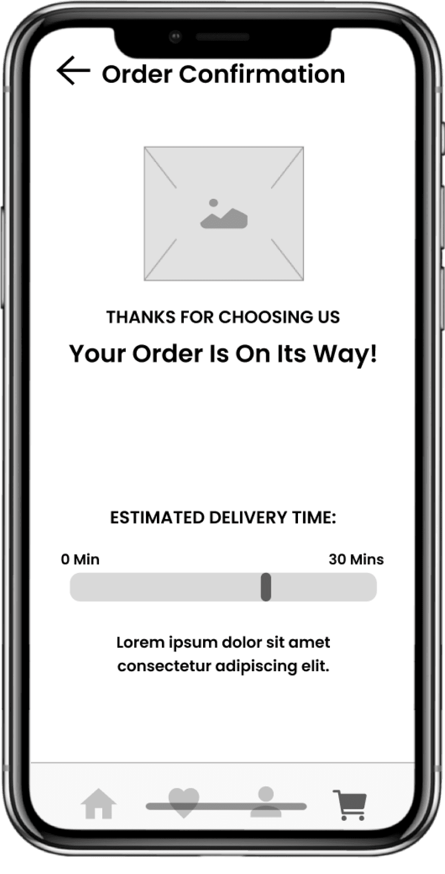
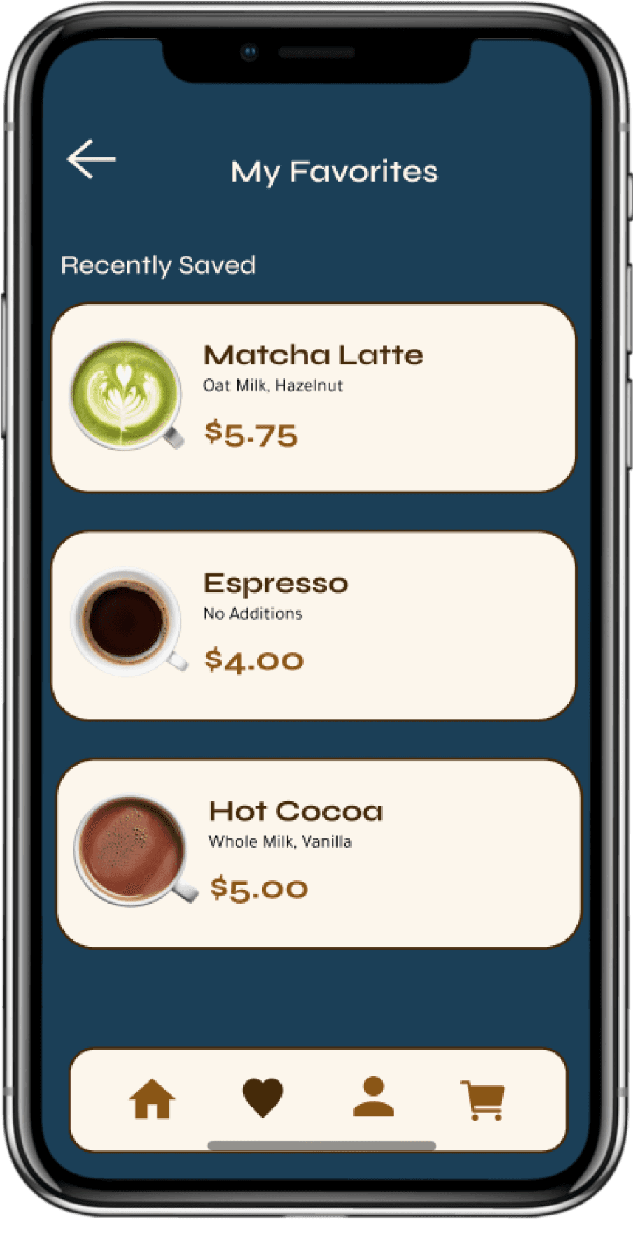
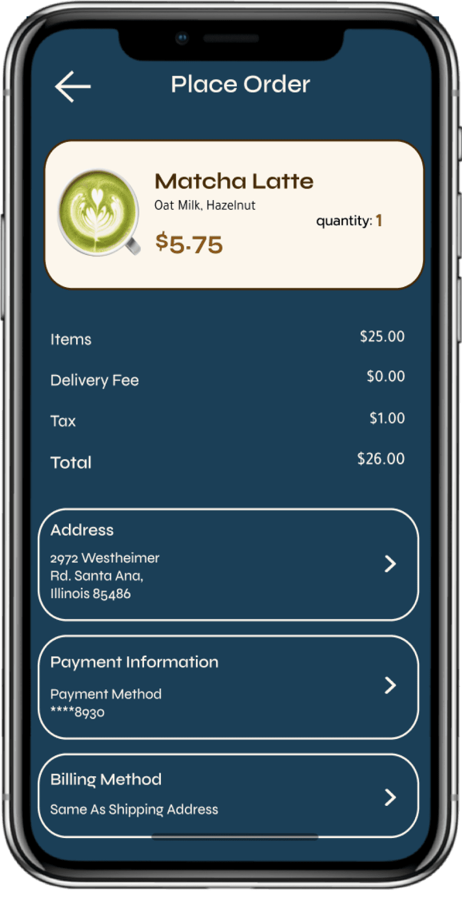
I added a couple more screens to the final high-fidelity mockups like a page to customize your drink, leaving all the buttons easily accessible. I also changed the delivery confirmation screen from a duration estimate to an estimated delivery time.
I added a couple more screens to the final high-fidelity mockups like a page to customize your drink, leaving all the buttons easily accessible. I also changed the delivery confirmation screen from a duration estimate to an estimated delivery time.
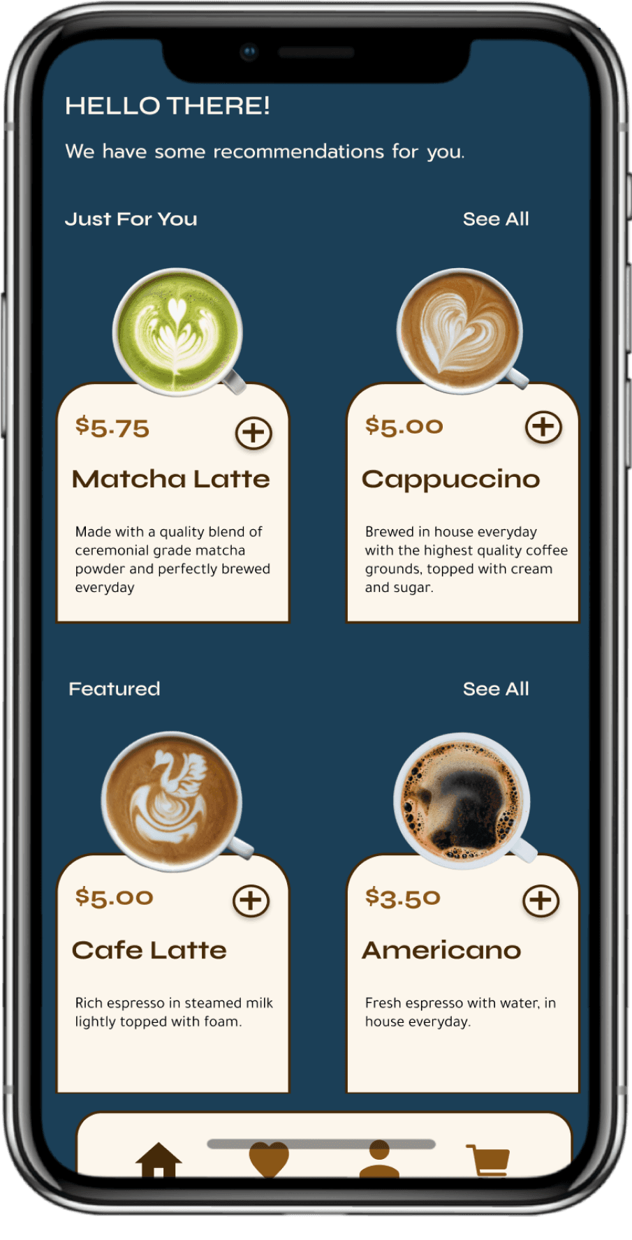
High-Fidelity
High-Fidelity
And Finally: Here's my final screens
And Finally: Here's my final screens
Adding the Finishing Touches
With the user feedback in mind, I stylized the pages and made the app look more modern and clean. I added a page to personalize your order with all the buttons easily accessible on the screen to reduce any confusion. I also adjusted the order confirmation page to give a better ETA because users would use a concrete time better than a countdown of a certain amount of minutes.
With the user feedback in mind, I stylized the pages and made the app look more modern and clean. I added a page to personalize your order with all the buttons easily accessible on the screen to reduce any confusion. I also adjusted the order confirmation page to give a better ETA because users would use a concrete time better than a countdown of a certain amount of minutes.
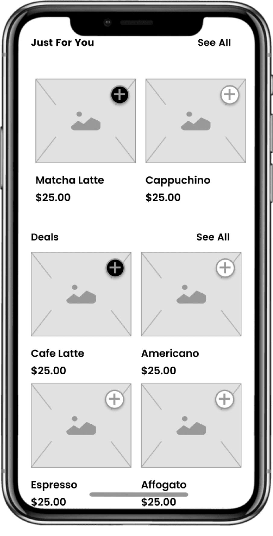
Home Screen
Home Screen
Finally: wrapping everything up with a home screen
Finally: wrapping everything up with a home screen
Finally: wrapping everything up with a home screen
Purpose
Purpose
Purpose
Now that all the components of the Nora Mock AI Interviewer are complete, all that's left is to create an informative home webpage that can tell users what Nora is about. From here they can gain insights to Nora's various features, how it works, and what they can gain by using Nora.
Now that all the components of the Nora Mock AI Interviewer are complete, all that's left is to create an informative home webpage that can tell users what Nora is about. From here they can gain insights to Nora's various features, how it works, and what they can gain by using Nora.
Now that all the components of the Nora Mock AI Interviewer are complete, all that's left is to create an informative home webpage that can tell users what Nora is about. From here they can gain insights to Nora's various features, how it works, and what they can gain by using Nora.
Reflection
Reflection + What I learned
Reflection + What I learned
Sometimes, Less Really is More
As a designer, I've had a lot of time to keep my eyes on this app and am constantly staring at my screens. This familiarity with the UI obviously gives me more background knowledge than the average user, so there was definitely a lot of learning done when I realized users wanted more simple screens and straightforward user flows.
As a designer, I've had a lot of time to keep my eyes on this app and am constantly staring at my screens. This familiarity with the UI obviously gives me more background knowledge than the average user, so there was definitely a lot of learning done when I realized users wanted more simple screens and straightforward user flows.
As a designer, I've had a lot of time to keep my eyes on this app and am constantly staring at my screens. This familiarity with the UI obviously gives me more background knowledge than the average user, so there was definitely a lot of learning done when I realized users wanted more simple screens and straightforward user flows.
Striking a Balance between Visual and Functionality
Striking a Balance between Visual and Functionality
Striking a Balance between Visual and Functionality
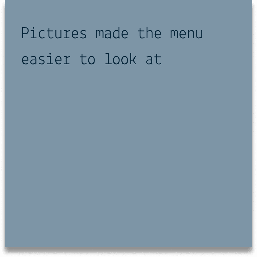
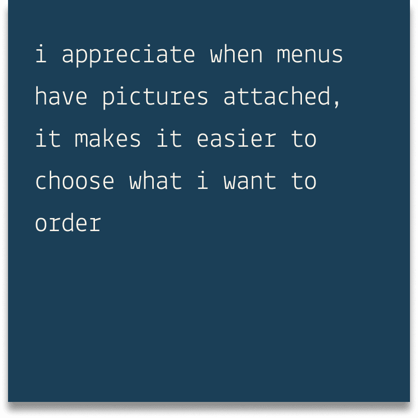
Before going into this app redesign, I was convinced that I would just need to focus on creating better user flows and focusing on the practical parts of UI design. However, after conducting my user research I couldn't deny all the comments on needing pictures and strong descriptions for the menu items. Here I realized that there is still a large importance to aesthetic even when there are functional issues, and I learned to balance both when redesigning the app.
Before going into this app redesign, I was convinced that I would just need to focus on creating better user flows and focusing on the practical parts of UI design. However, after conducting my user research I couldn't deny all the comments on needing pictures and strong descriptions for the menu items. Here I realized that there is still a large importance to aesthetic even when there are functional issues, and I learned to balance both when redesigning the app.
Before going into this app redesign, I was convinced that I would just need to focus on creating better user flows and focusing on the practical parts of UI design. However, after conducting my user research I couldn't deny all the comments on needing pictures and strong descriptions for the menu items. Here I realized that there is still a large importance to aesthetic even when there are functional issues, and I learned to balance both when redesigning the app.