
What is Mocha Nut Coffee?
Create a seamless app experience for coffee lovers
The Design Process

Seeing the app from a usability standpoint
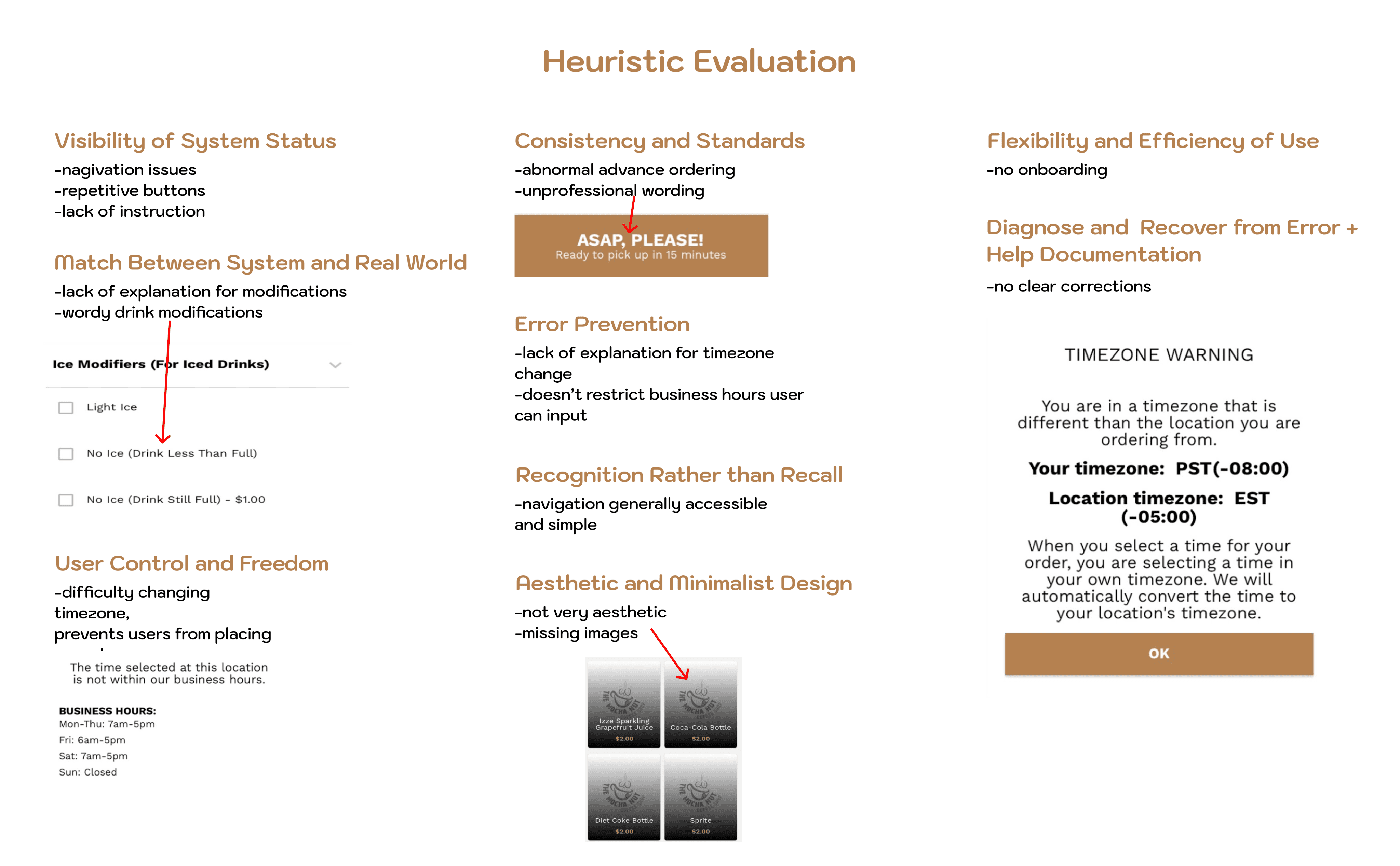
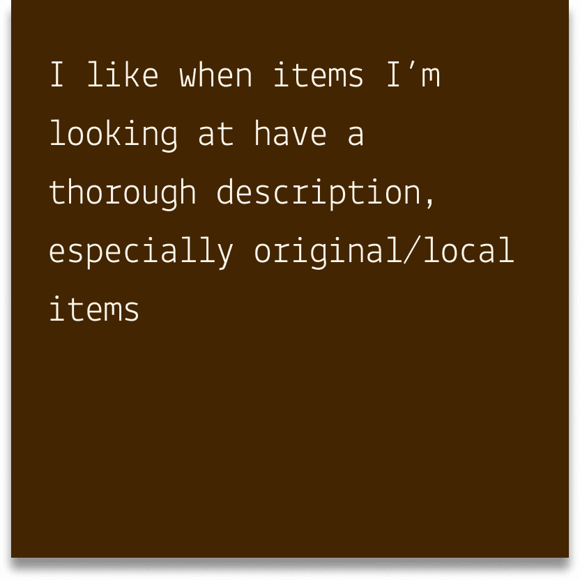
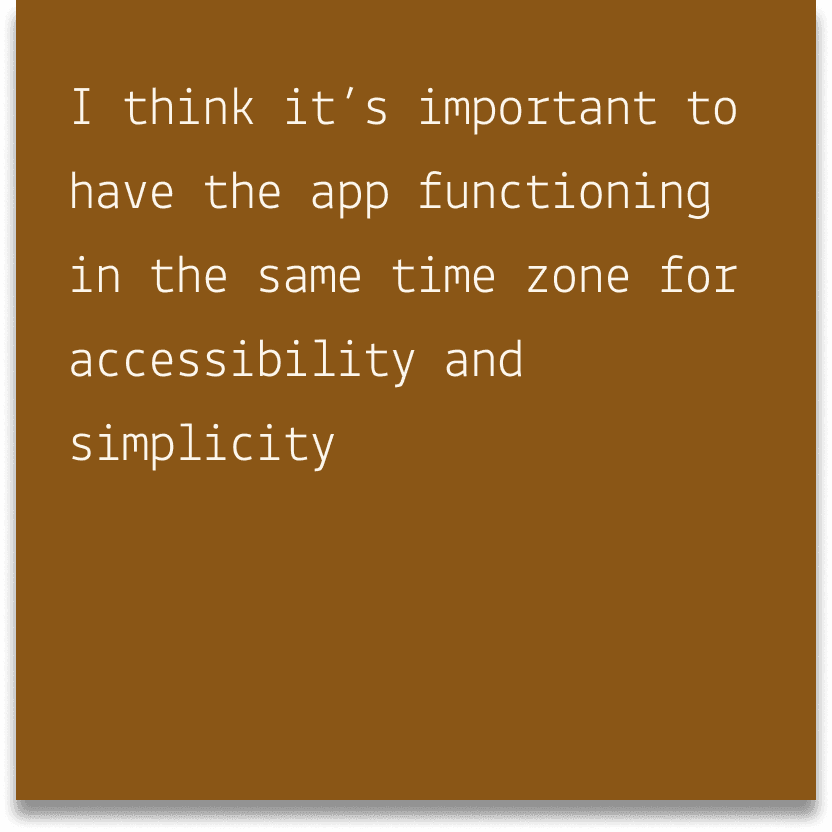
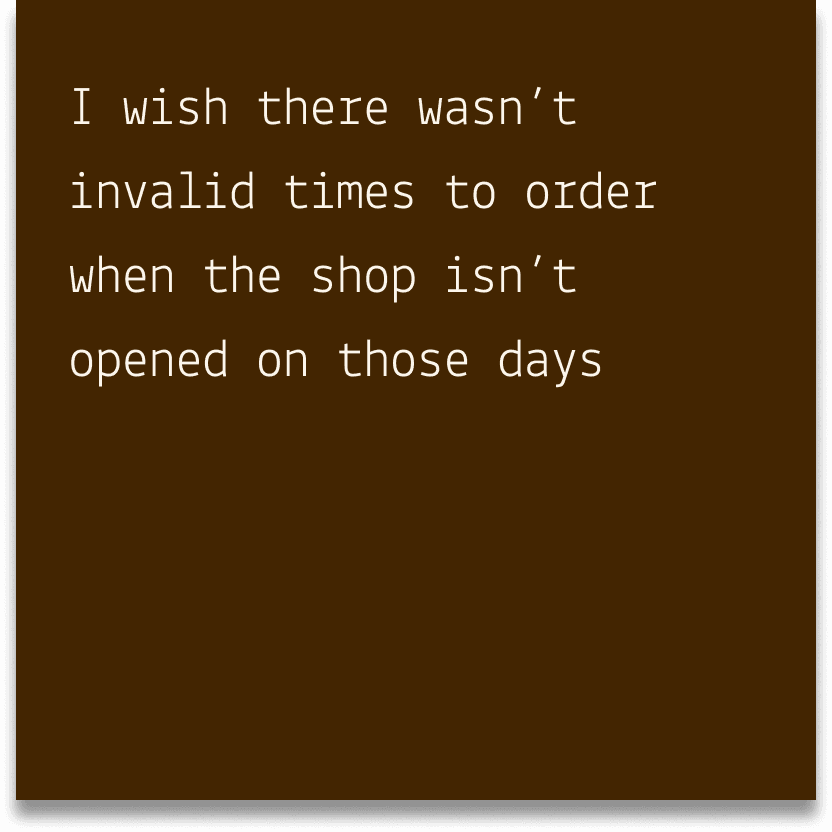
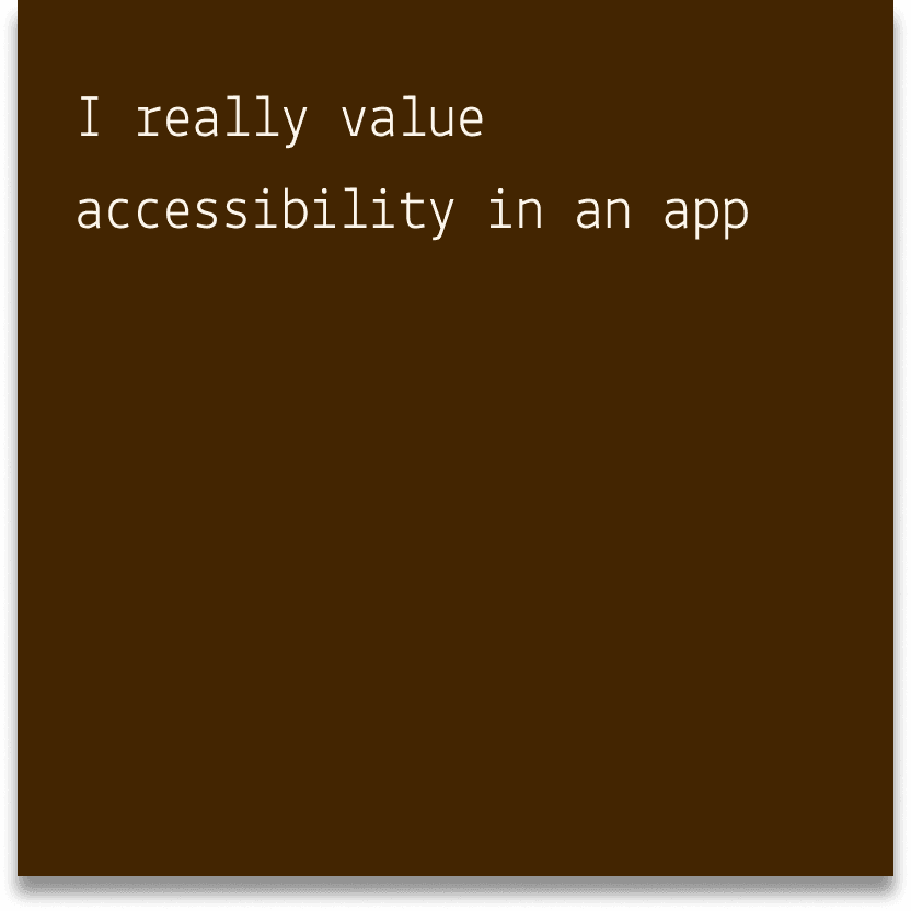
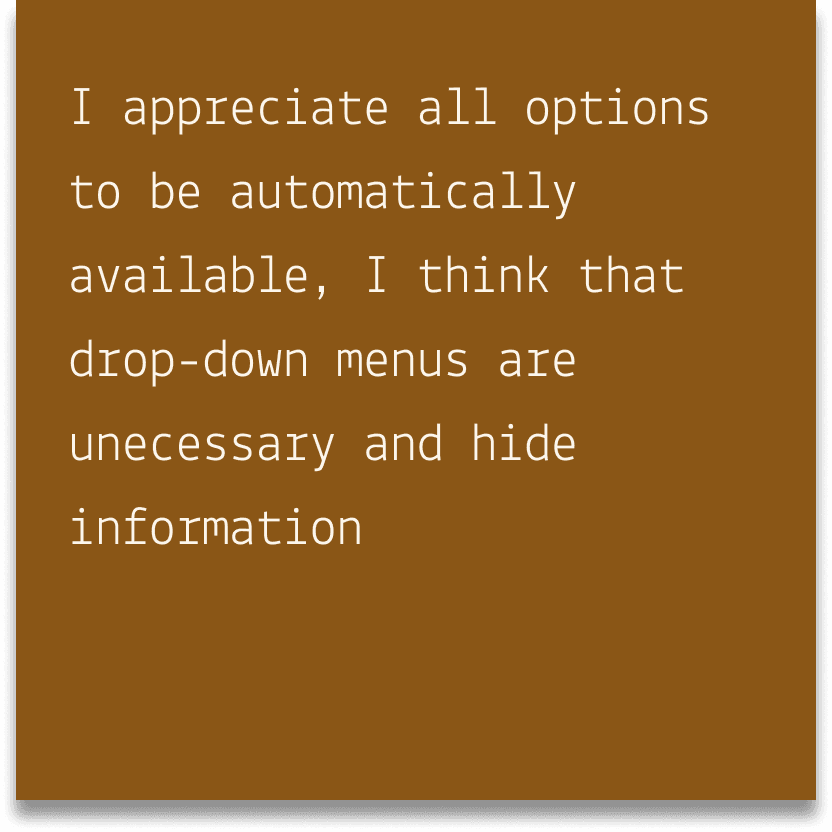
Informed Decisions
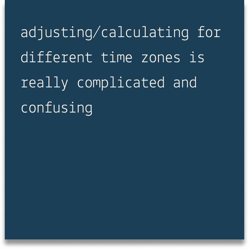
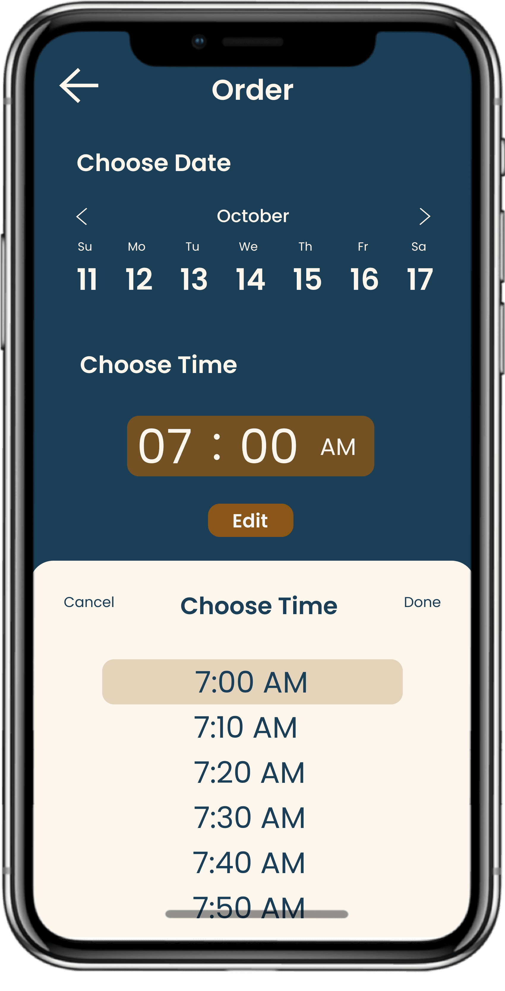
Clear Time Zone
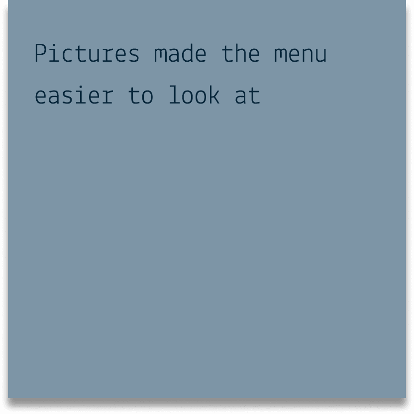
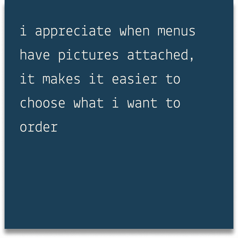
Accessible UI
Figuring out the problem

In this stage, I created numerous low-fidelity wireframes, implementing key user feedback in my updated designs and aiming closer to an ideal final product from the user's standpoint.
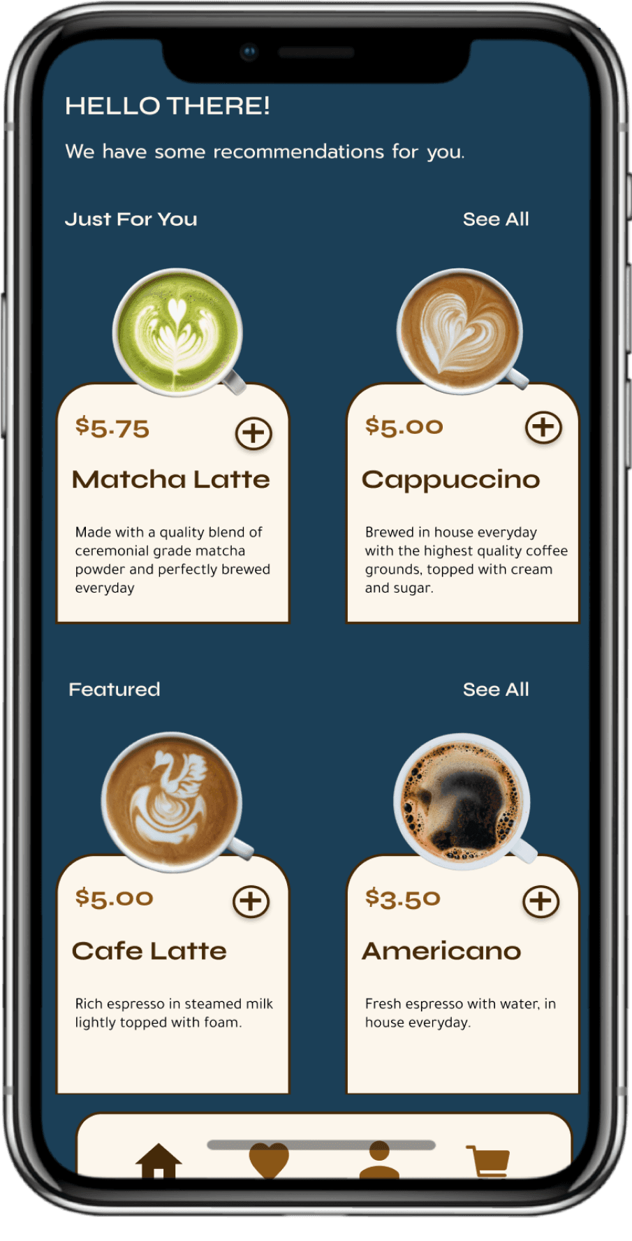
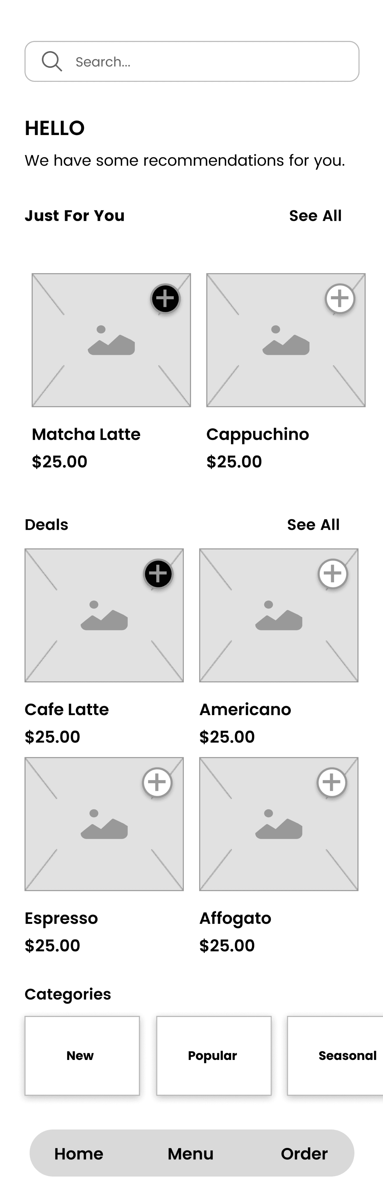
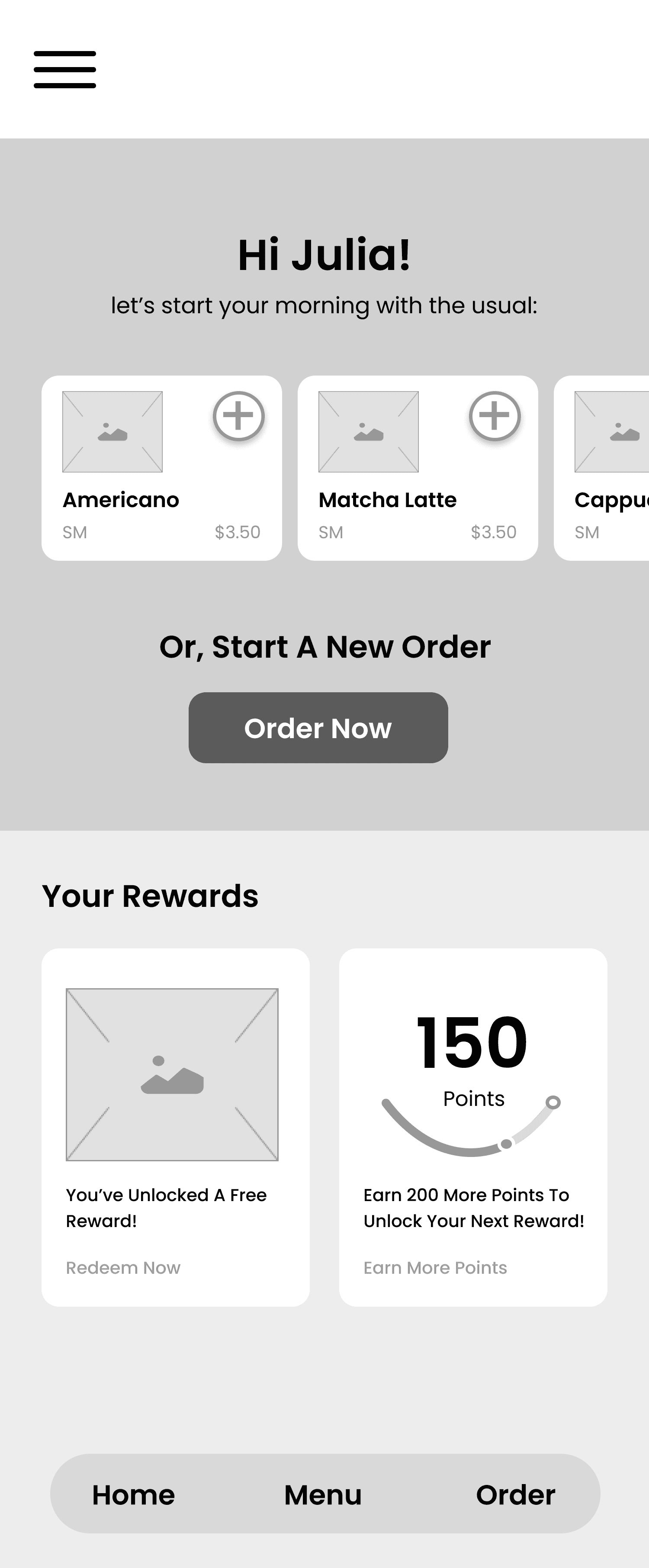
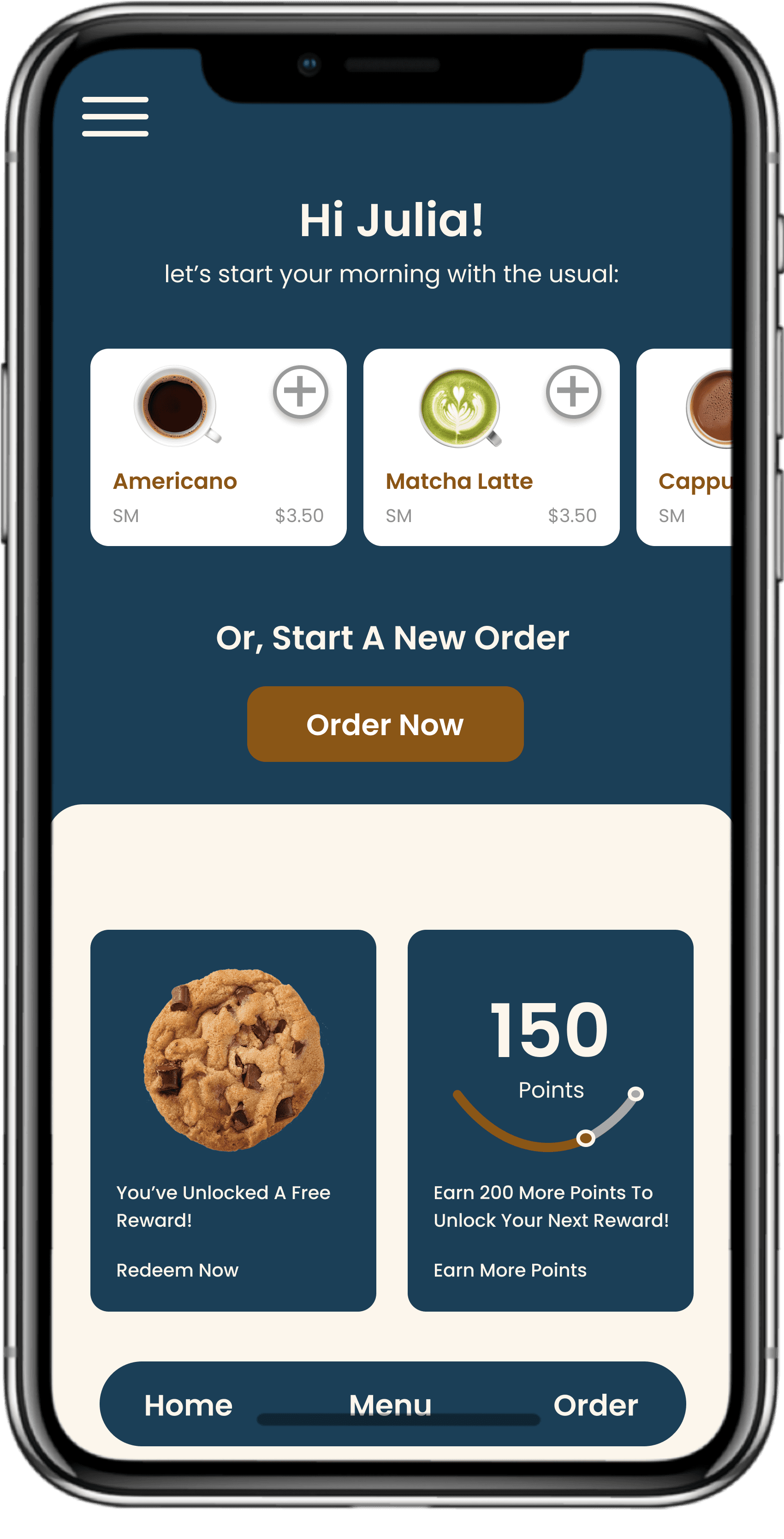
Home Screen
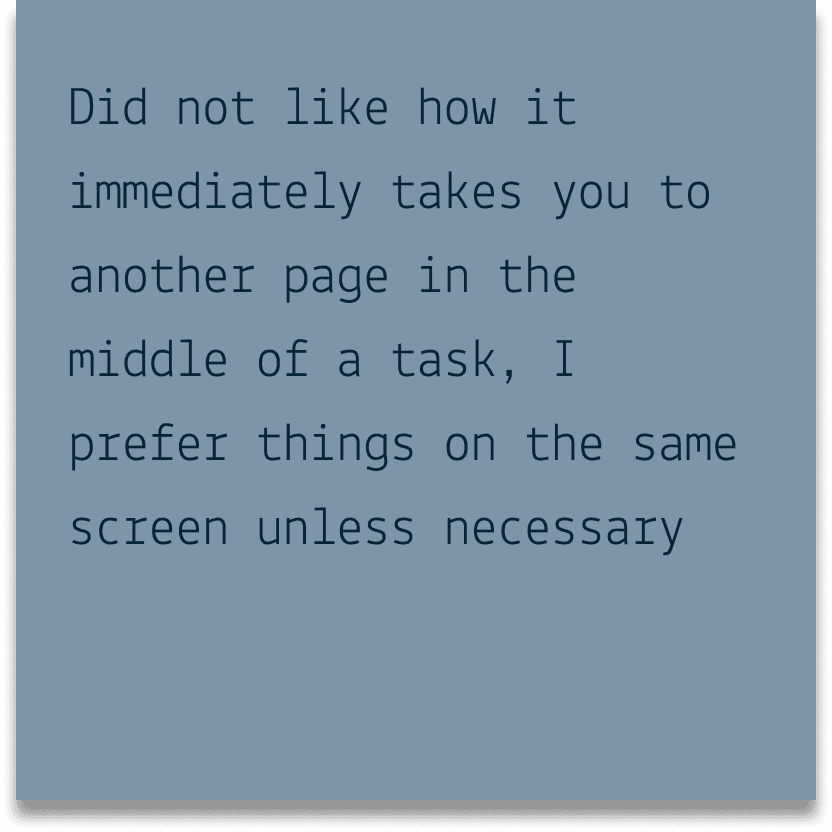
Version 1: In my initial wireframe, I wanted to increase visibility and accessibility for the user, therefore I laid out all the possible options and suggestions for them to order. However, this proved to be a bit overwhelming for some users after having conducted initial usability tests.
Version 2: In this second version, I simplified the options, recommending users a few favorites based on past orders. I've also given users the choice to choose a new order as well if they weren't satisfied with any of the suggestions. Additionally, I included a section for rewards towards the bottom because it was largely overlooked in the original app. I made sure implement it in a largely visible way that let users know how many rewards they've accumulated and potential rewards they can claim.
Version 1
Version 2
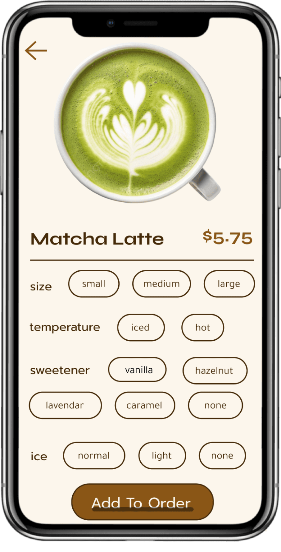
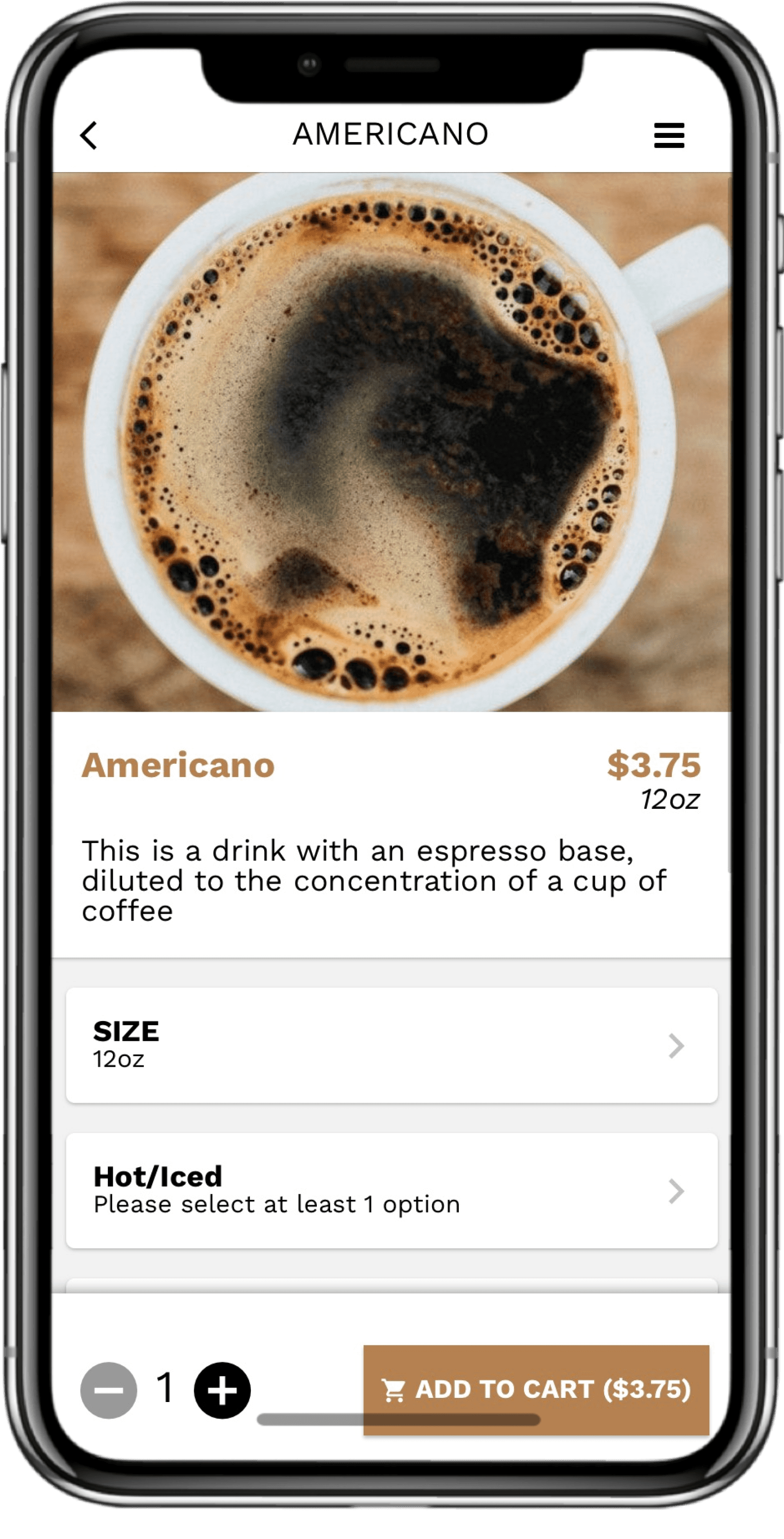
Menu Item
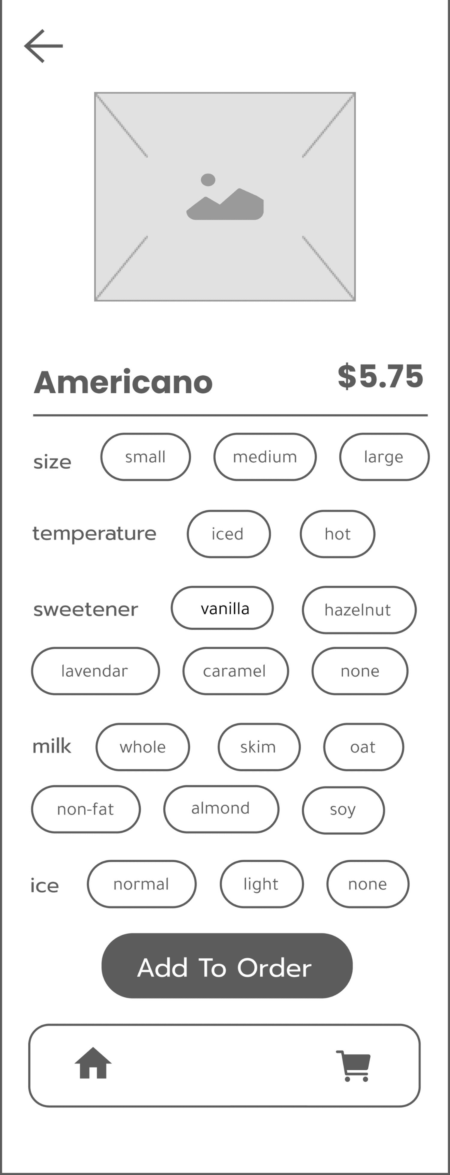
Version 1: Similarly to the home screen, my main objective with this wireframe was to increase accessibility and give users easy viewing of all their possible options so it is easy to select their drink at a single glance. However, this proved overwhelming.
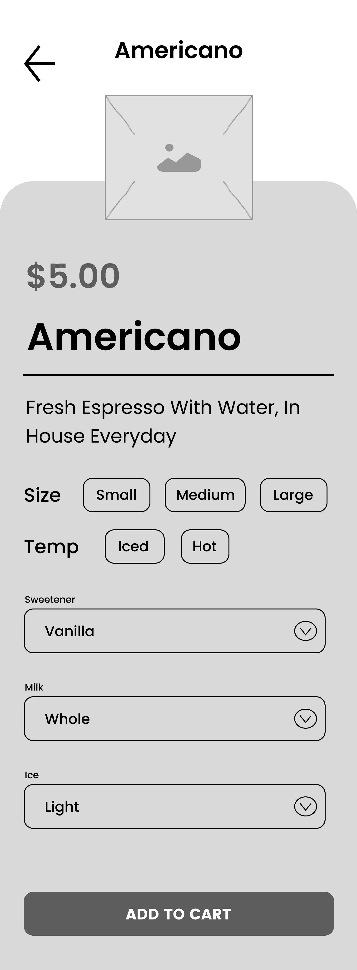
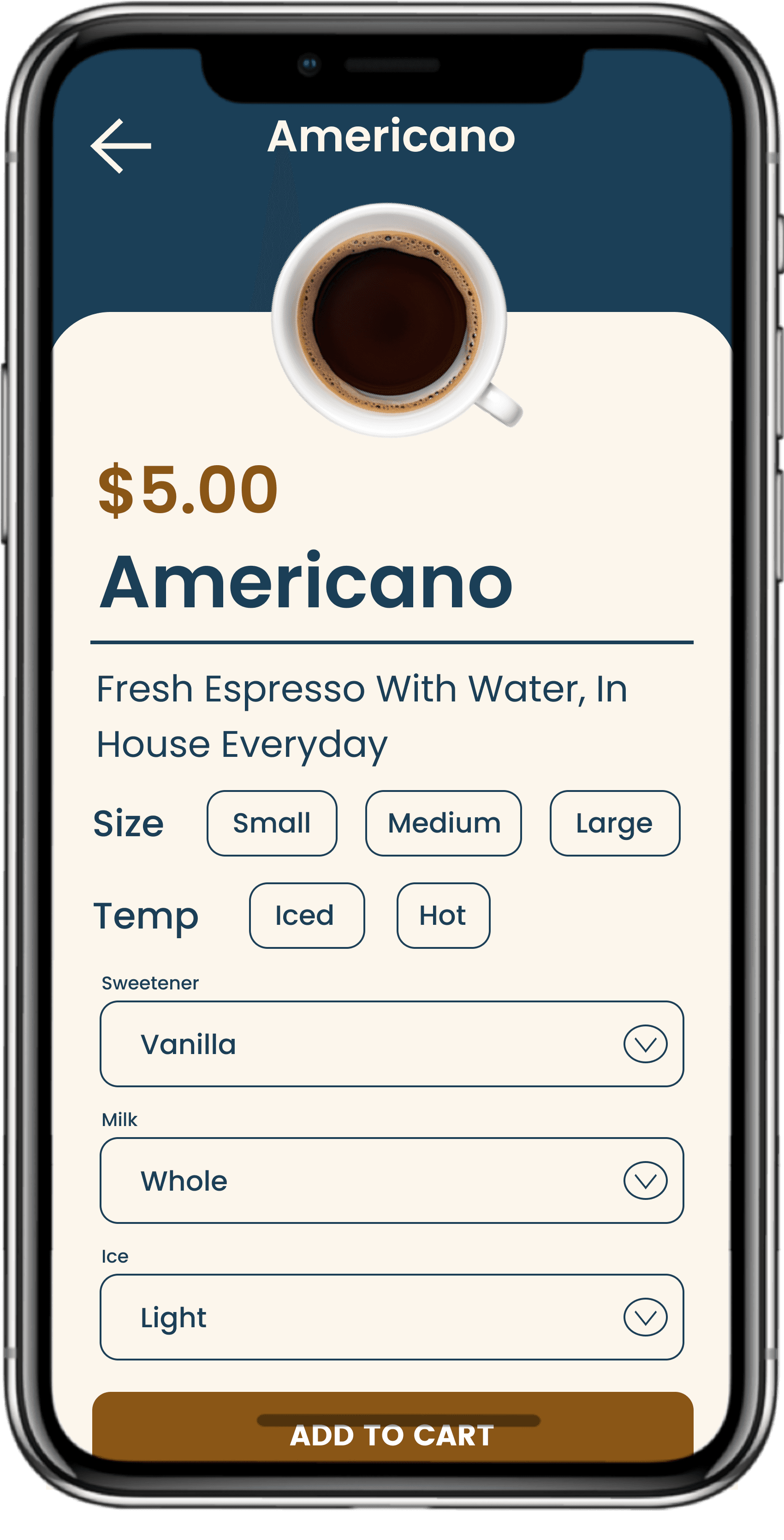
Version 2: With this wireframe, I utilized dropdowns to save space on the screen, allowing users to customize their drinks if they please, again, giving them more choice and freedom. I also got rid of the old navigation bar because I didn't think it'd be necessary for the user to go back to another screen when they were about to order.
Version 1
Version 2
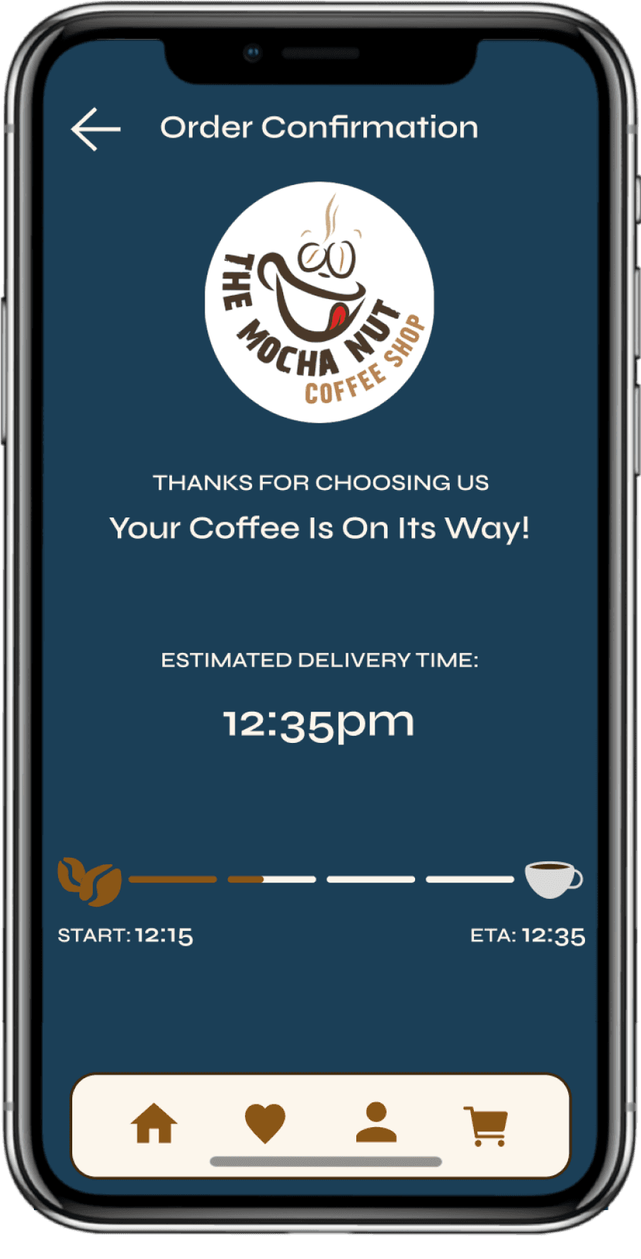
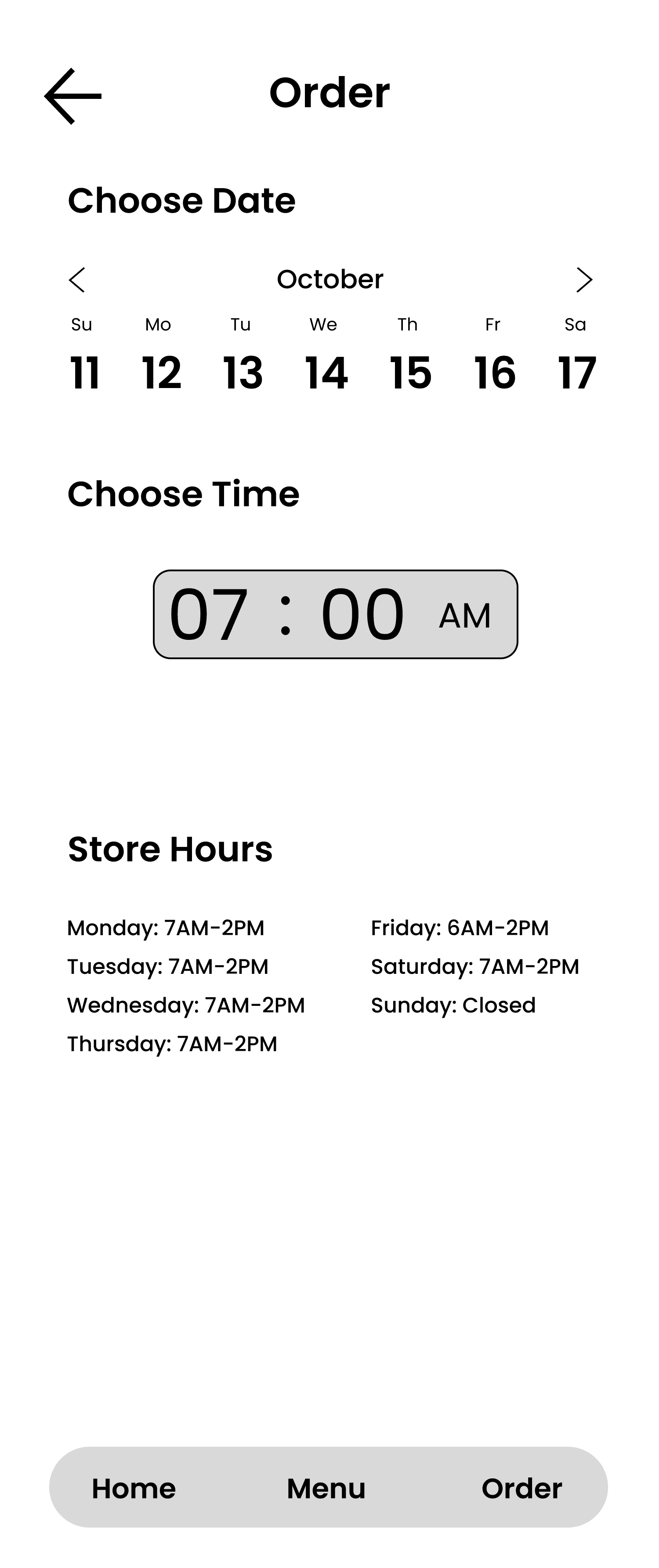
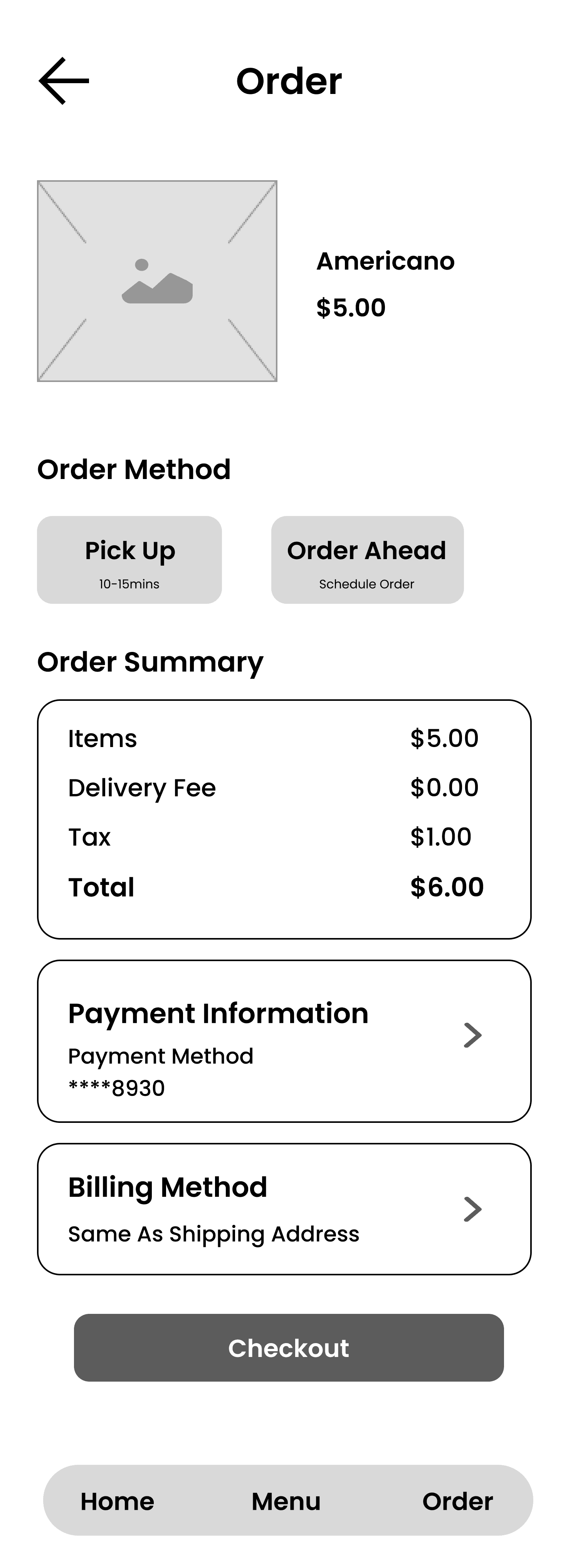
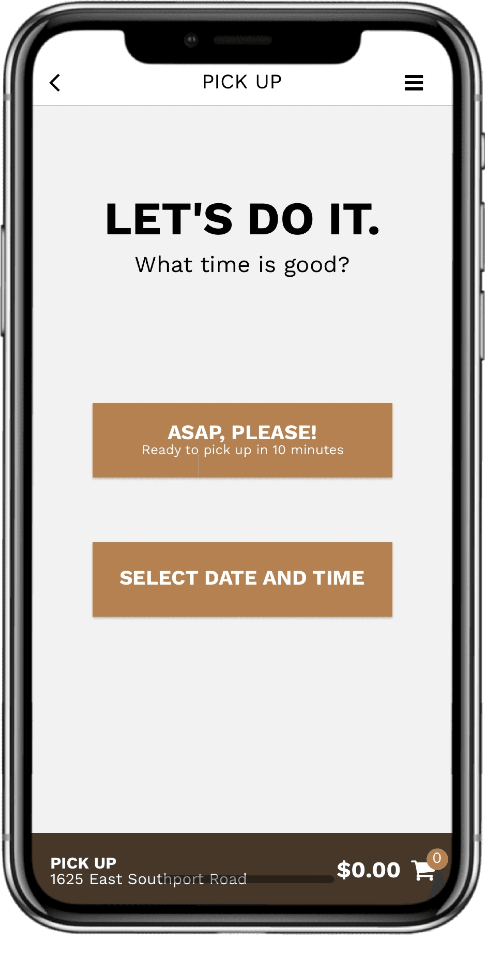
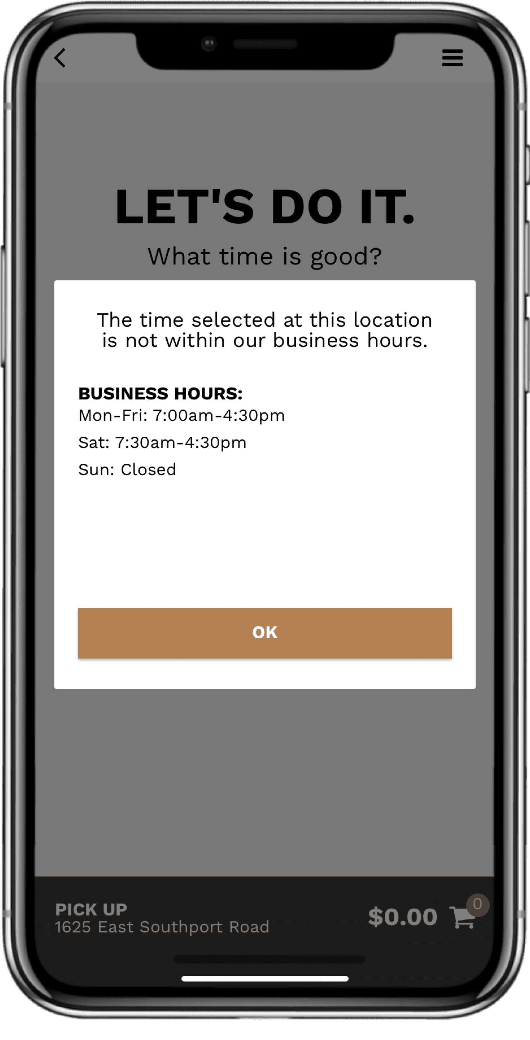
Version 1: In this first flow, I wanted to offer users
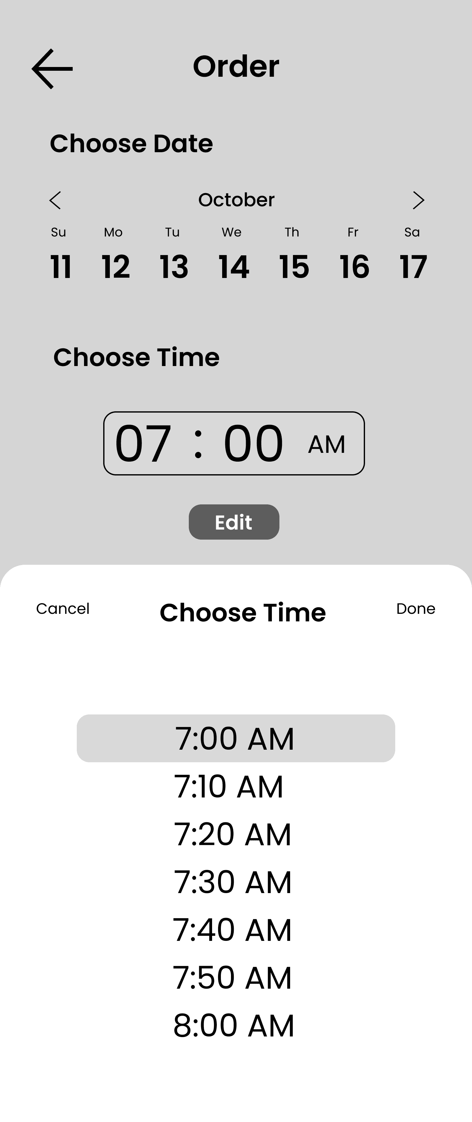
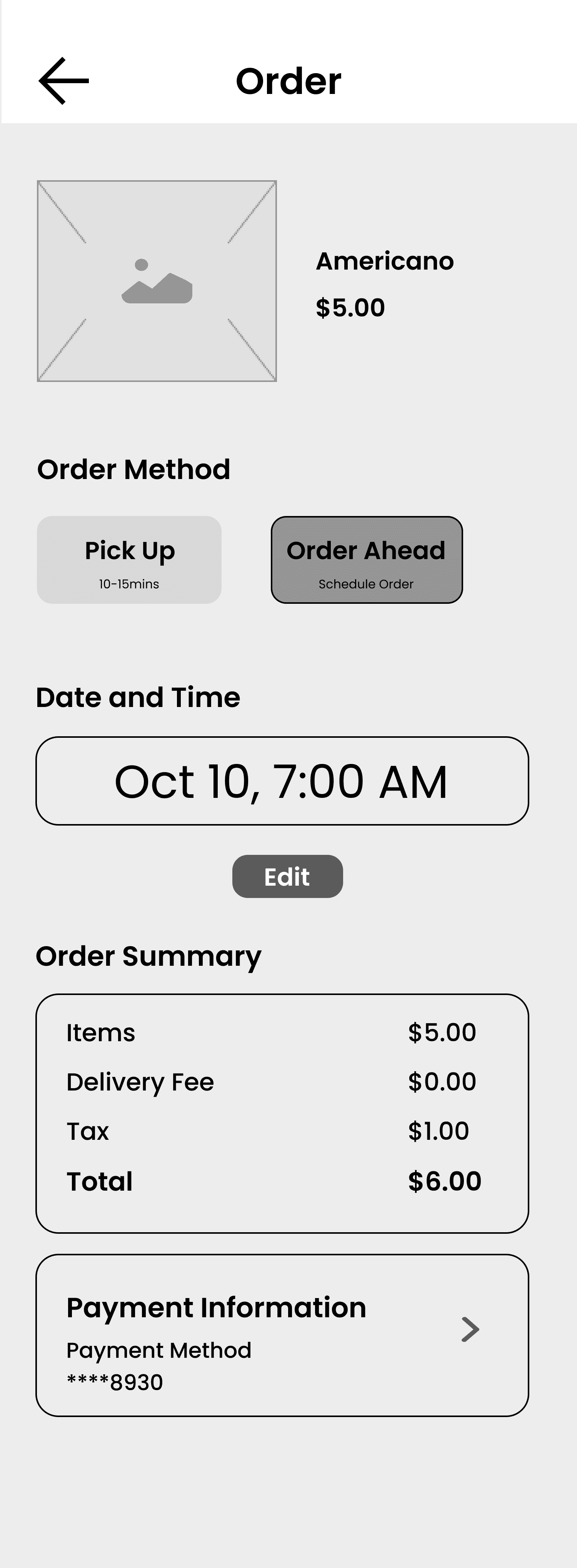
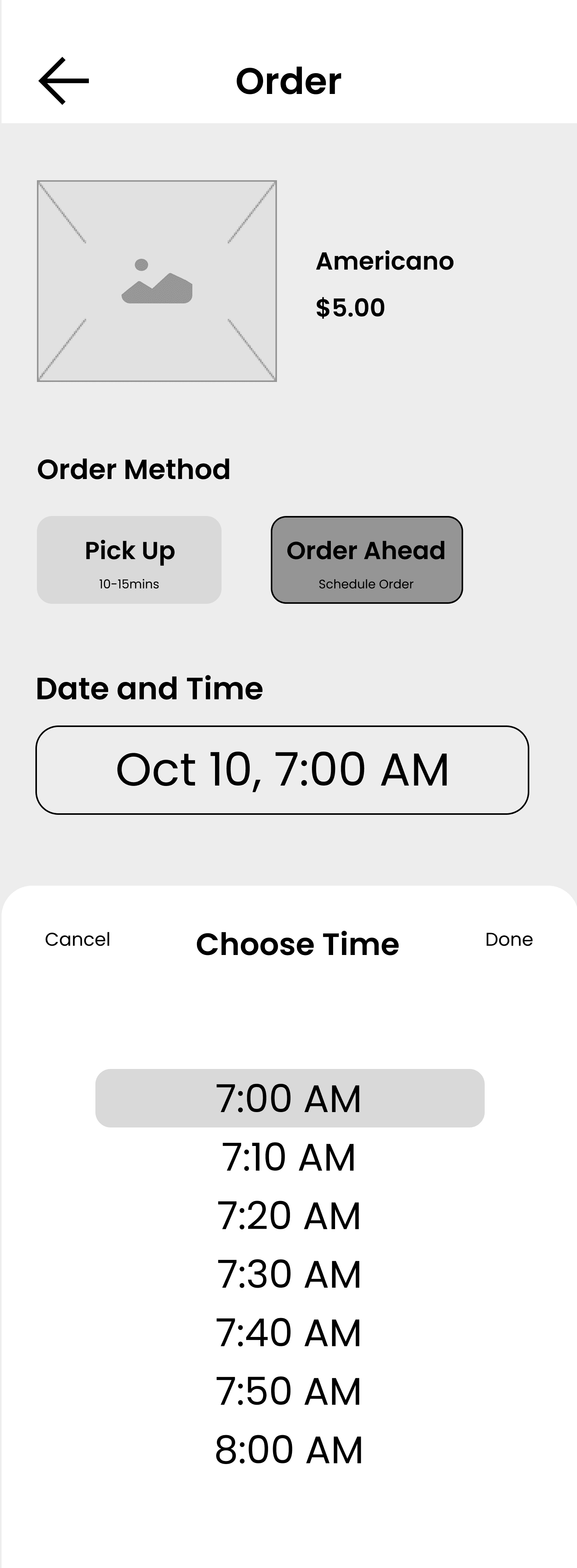
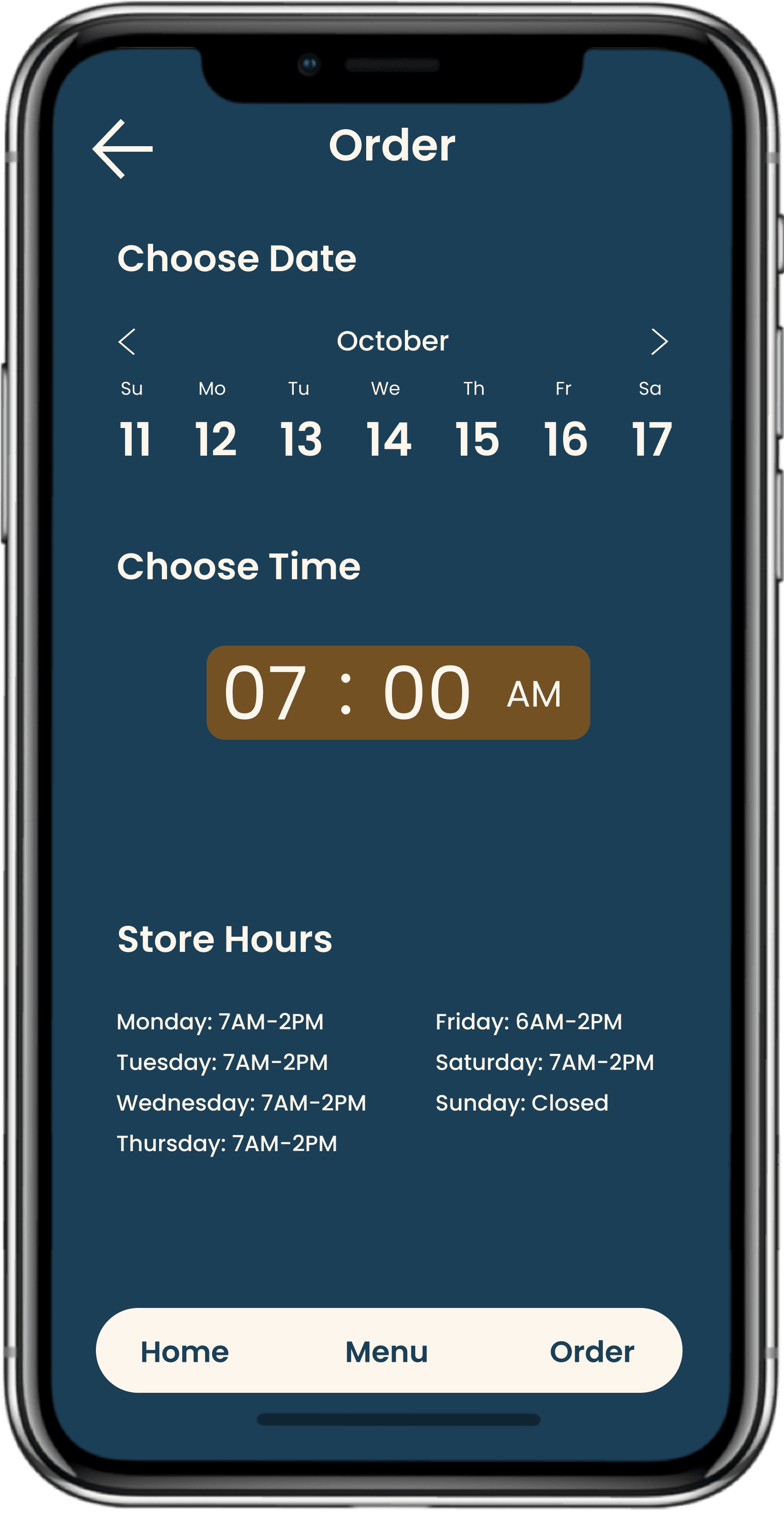
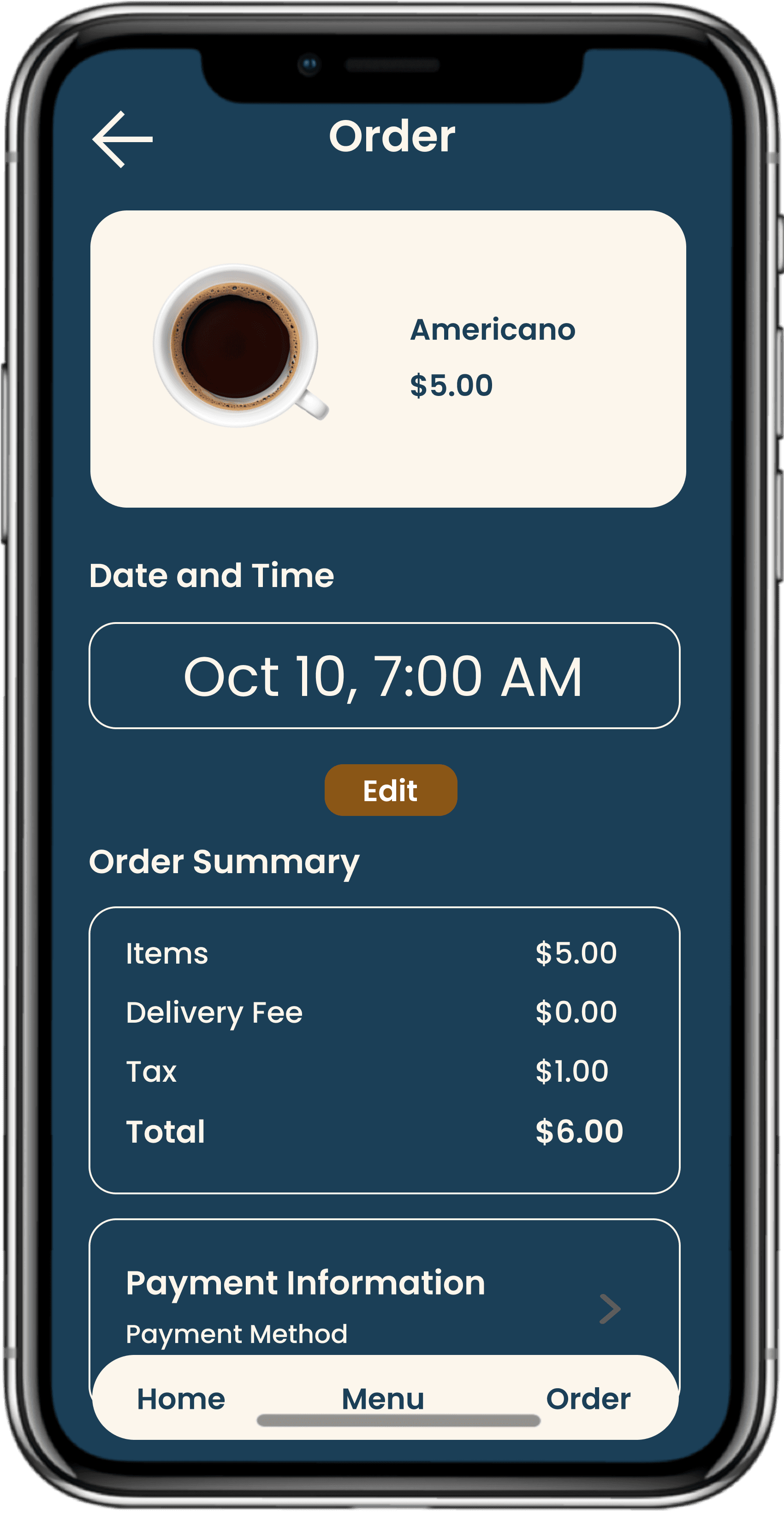
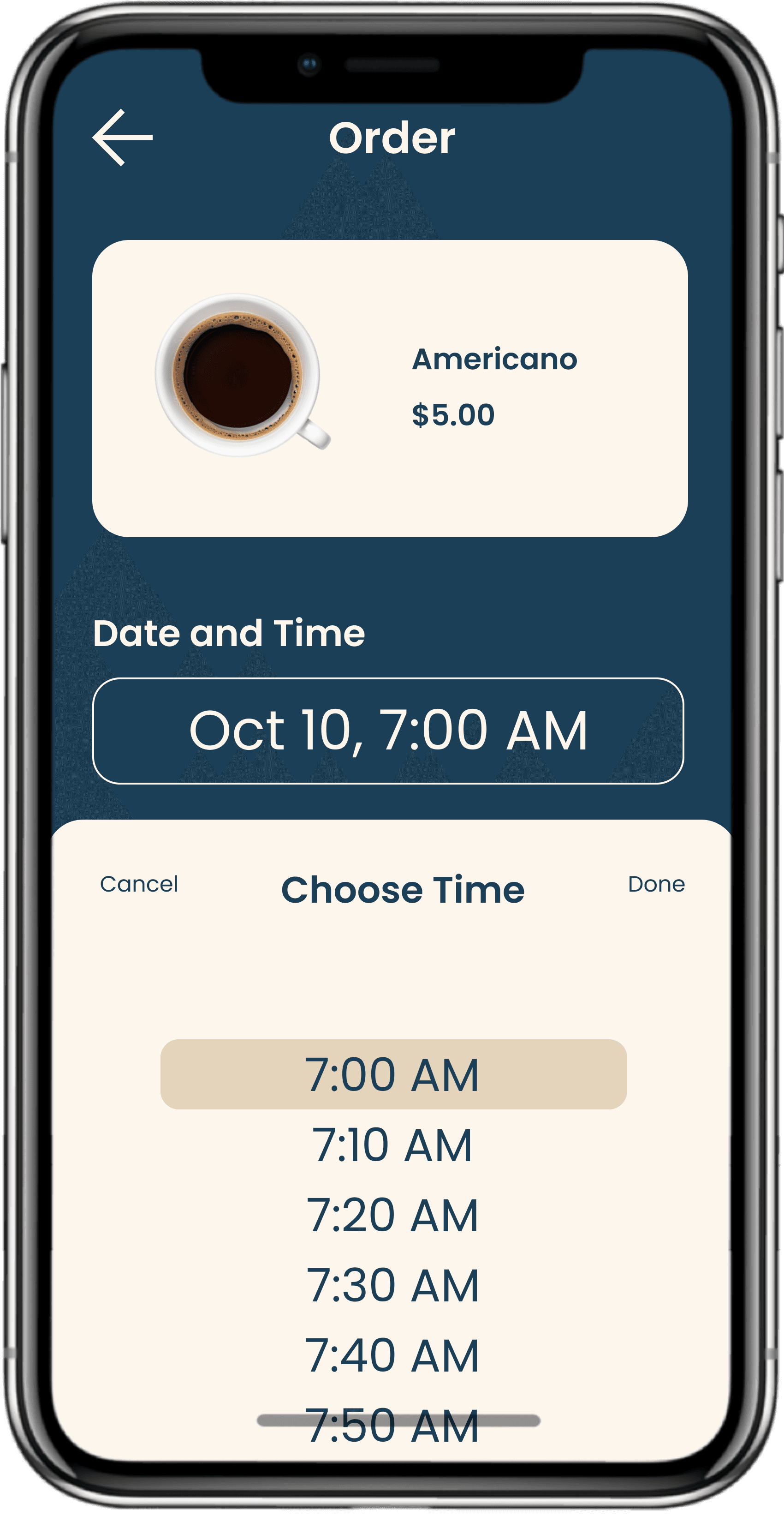
Version 2: With this wireframe, I utilized dropdowns to save space on the screen, allowing users to customize their drinks if they please, again, giving them more choice and freedom. I also got rid of the old navigation bar because I didn't think it'd be necessary for the user to go back to another screen when they were about to order.
Version 1
Version 2

Sometimes, Less Really is More
The Importance of Wording