The Intern Guys UI/UX Design Internship
The Intern Guys UI/UX Design Internship
The Intern Guys UI/UX Design Internship
A company committed to streamlining the interview process for students
A company committed to streamlining the interview process for students
A company committed to streamlining the interview process for students
My Role
My Role
My Role
UI/UX Designer
UI/UX Designer
UI/UX Designer
Skills
Skills
My Role
Ideation, User Research, Usability Testing, Wireframing, Prototyping
Ideation, User Research, Usability Testing, Wireframing, Prototyping
Ideation, User Research, Usability Testing, Wireframing, Prototyping
Team
Team
Team
Hannan Hussain (CEO), UI/UX Team, Dev Team, Marketing Team
Hannan Hussain (CEO), UI/UX Team, Dev Team, Marketing Team
Hannan Hussain (CEO), UI/UX Team, Dev Team, Marketing Team
Timeline
Timeline
Timeline
Jul 2024-Sep 2024
Jul 2024-Sep 2024
Jul 2024-Sep 2024
intro
intro
A little bit about this internship first…
A little bit about this internship first…
A little bit about this internship first…
This summer I had the chance to work as a UI/UX Design Intern at the Intern Guys. They are a startup company focusing on optimizing the internship application process for students, and offer a variety of resources including interview prep, accessible internship opportunities, and even advice.
The Intern Guys were in the middle of launching an entirely new service as I joined: the Nora AI Mock Interviewer. This was an exciting new tool that was really going to make a positive impact on students preparing for interviews. I partook in active product decision-making, conducting market research, designed low to high fidelity wireframes, and was constantly making iterations before and after our product launch.
My work primarily boiled down to 1 major project and 2 more minor features: a new homescreen, payment screens, and a technical slider. Feel free to view them below!
Background, what exactly does Nora AI Mock Interviewer and why is this important for other students to have this as a learning tool, basically just a general background on why you did this in the first place, how does it help the world.
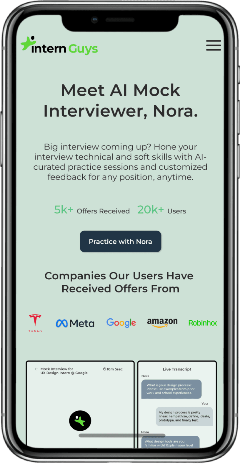
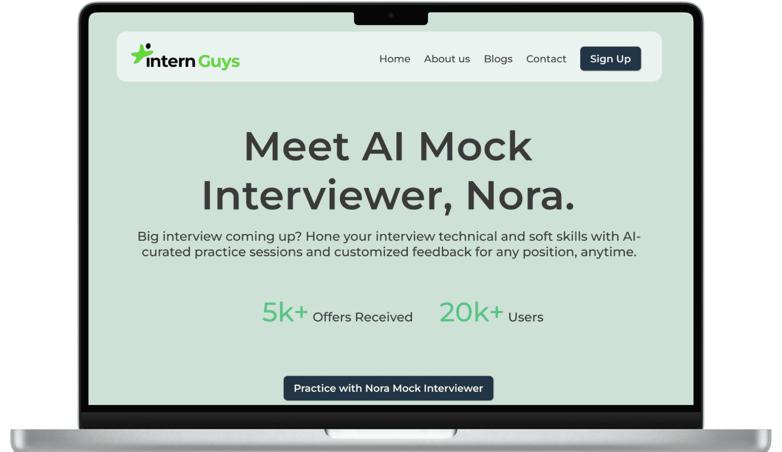
Nora AI Mock Interviewer Homepage
Nora AI Mock Interviewer Homepage
Nora AI Mock Interviewer Homepage
overview
overview
Before we get started, what exactly is Nora?
Before we get started, what exactly is Nora?
Before we get started, what exactly is Nora?
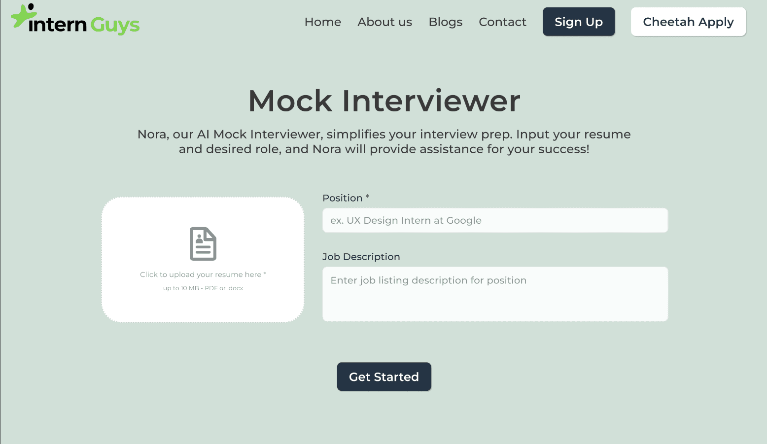
The Nora AI Mock Interviewer is the newest service launched by the Intern Guys. She is essentially an AI program that can handle real-time interviews.
Before starting an interview, the user is prompted to enter their resume, a job position, for example, a UI/UX Designer at Amazon, and that position's job description. From there, Nora asks the user aloud customized questions that are based off the position's job description as well as incorporating information from the user's resume.
Background, what exactly does Nora AI Mock Interviewer and why is this important for other students to have this as a learning tool, basically just a general background on why you did this in the first place, how does it help the world.
The user can respond in real-time with Nora's quick text-to-speech capabilities, and she will incorporate information from the user's responses to craft responding questions, just like a real interview.
The user can respond in real-time with Nora's quick text-to-speech capabilities, and she will incorporate information from the user's responses to craft responding questions, just like a real interview.
Background, what exactly does Nora AI Mock Interviewer and why is this important for other students to have this as a learning tool, basically just a general background on why you did this in the first place, how does it help the world.
problem
problem
Back to the issue at hand: the (old) homepage
Back to the issue at hand: the (old) homepage
Back to the issue at hand: the (old) homepage
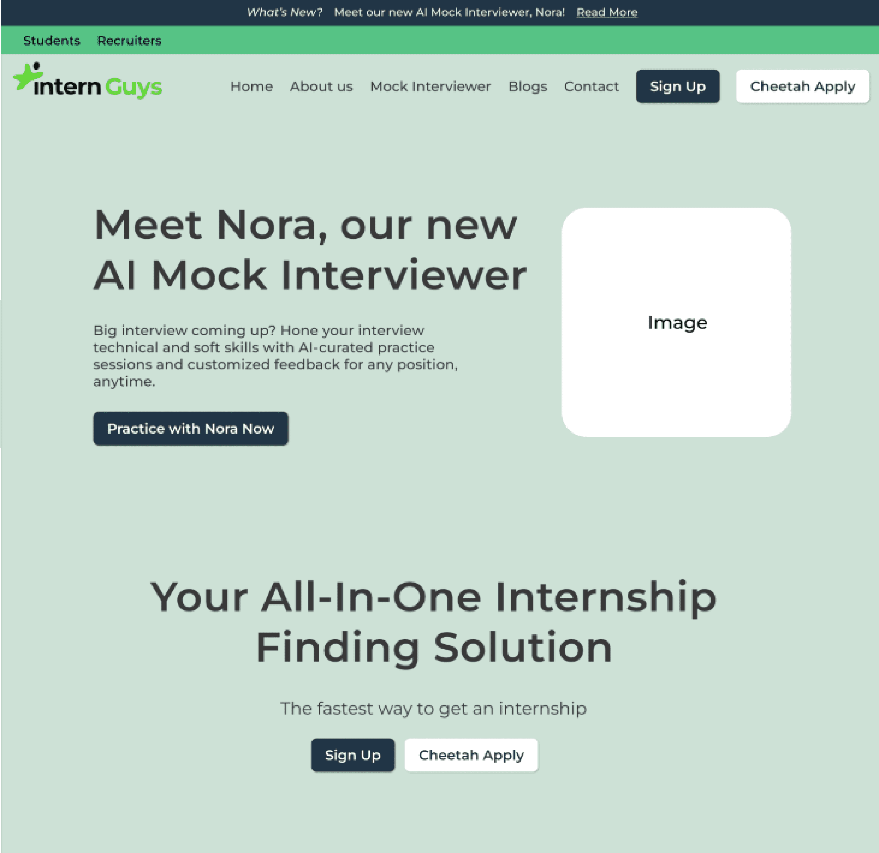
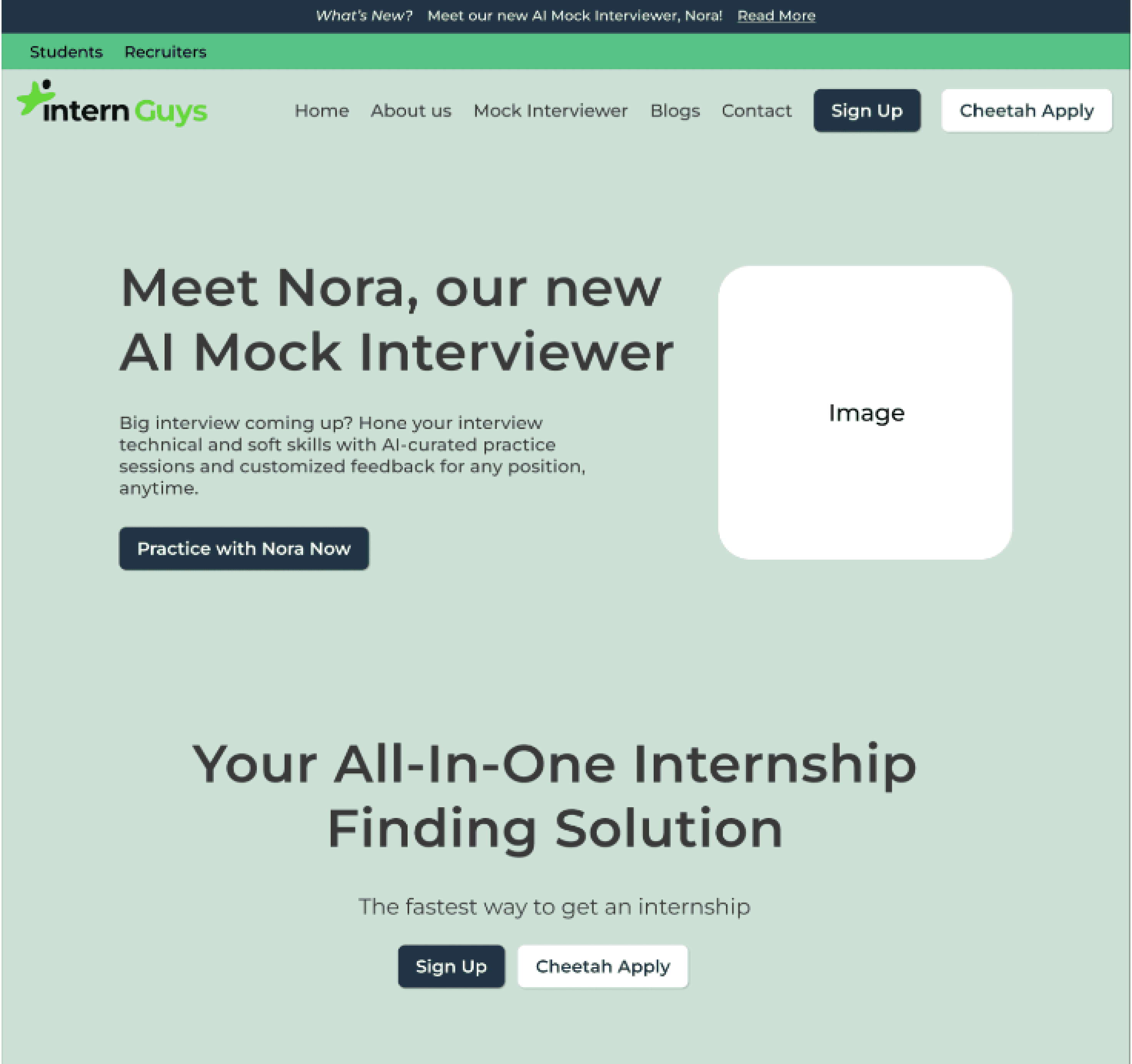
The current homepage for the Intern Guys was far outdated and overall just confusing with their existing services and the new addition of Nora. My goal is to design a simple, comprehensive homepage that explains what Nora is and how she works, with testimonials and other metrics to attract students.
The current homepage for the Intern Guys was far outdated and overall just confusing with their existing services and the new addition of Nora. My goal is to design a simple, comprehensive homepage that explains what Nora is and how she works, with testimonials and other metrics to attract students.
New Nora Mock Interviewer
New Nora Mock Interviewer
Original internship application portal
Original internship application portal
The Nora AI Mock Interviewer is the newest service launched by the Intern Guys. She is essentially an AI program that can handle real-time interviews.
Before starting an interview, the user is prompted to enter their resume, a job position, for example, a UI/UX Designer at Amazon, and that position's job description. From there, Nora asks the user aloud customized questions that are based off the position's job description as well as incorporating information from the user's resume.
New Nora Mock
Interviewer
research
research
Research
What are our competitors doing that we're not?
What are our competitors doing that we're not?
Competitive Analysis: SWOT
Competitive Analysis: SWOT
Competitive Analysis: SWOT
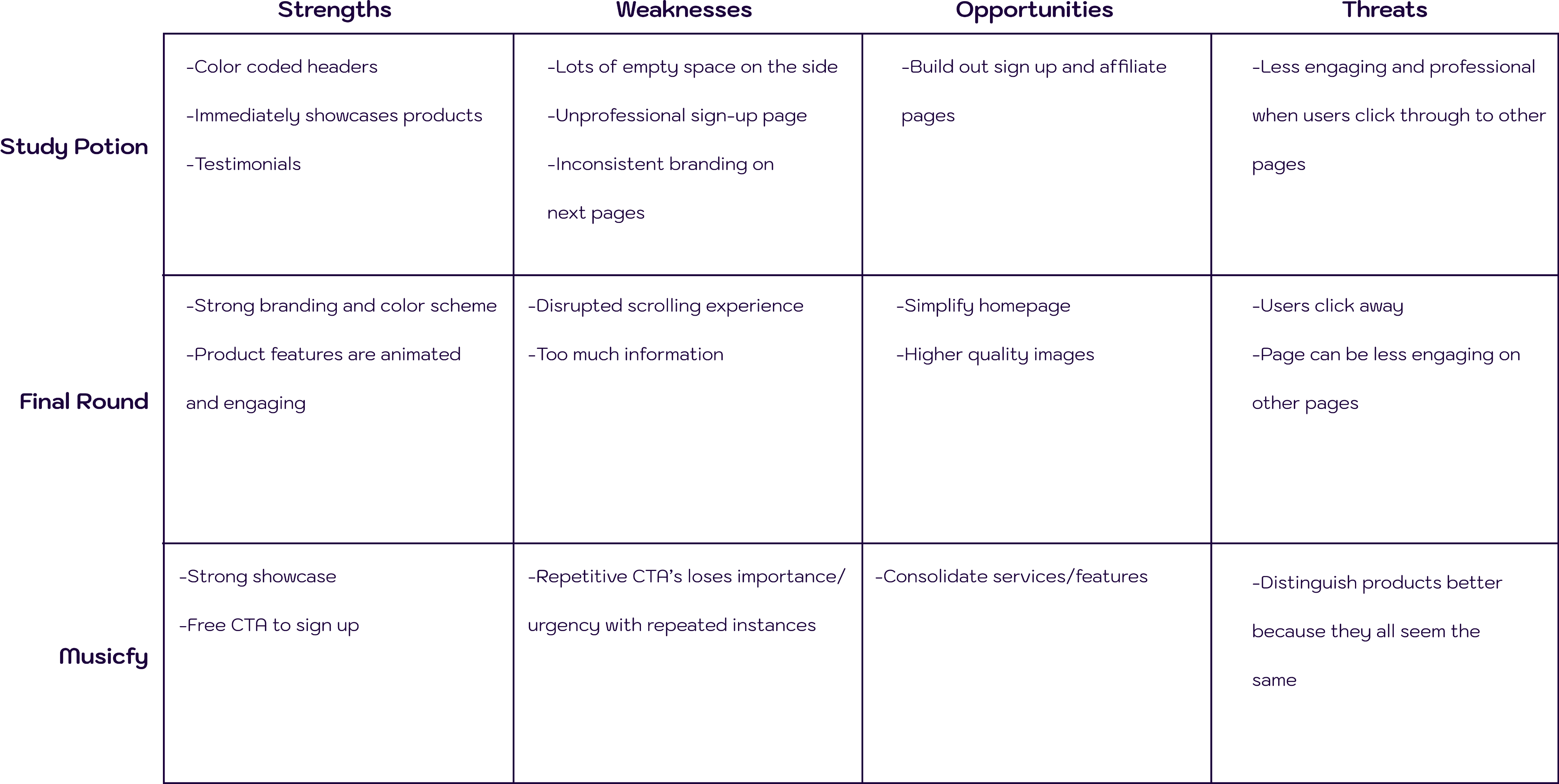
I conducted a SWOT analysis of 3 major competitors (2 being direct competitors and one from another field): Study potion, Final Round AI, and Musicfy. This analysis allowed me to extract a couple main insights from these competing sites.
I conducted a SWOT analysis of 3 major competitors (2 being direct competitors and one from another field): Study potion, Final Round AI, and Musicfy. This analysis allowed me to extract a couple main insights from these competing sites.
I conducted a SWOT analysis of 3 major competitors (2 being direct competitors and one from another field): Study potion, Final Round AI, and Musicfy. This analysis allowed me to extract a couple main insights from these competing sites.
Main Takeaways
Main Takeaways
Main Takeaways
Overall, all sites had really engaging presentations of their product's features, giving the user an interesting insight into how the service would actually look. The main weaknesses to these sites were an overload of information or repetitive CTAs which consequently lose the user's interest as they continue to scroll through the website.
By far, Final Round AI was the strongest competitor in terms of its branding, color scheme, and comprehensive product features.
define
define
Define
What does the new homepage need to look like?
What does the new homepage need to look like?
End Goal
End Goal
End Goal
My task was to create a new homepage that would clearly inform users on how Nora AI Mock Interviewer works, as well as encourage them to subscribe.
My task was to create a new homepage that would clearly inform users on how Nora AI Mock Interviewer works, as well as encourage them to subscribe.
My task was to create a new homepage that would clearly inform users on how Nora AI Mock Interviewer works, as well as encourage them to subscribe.
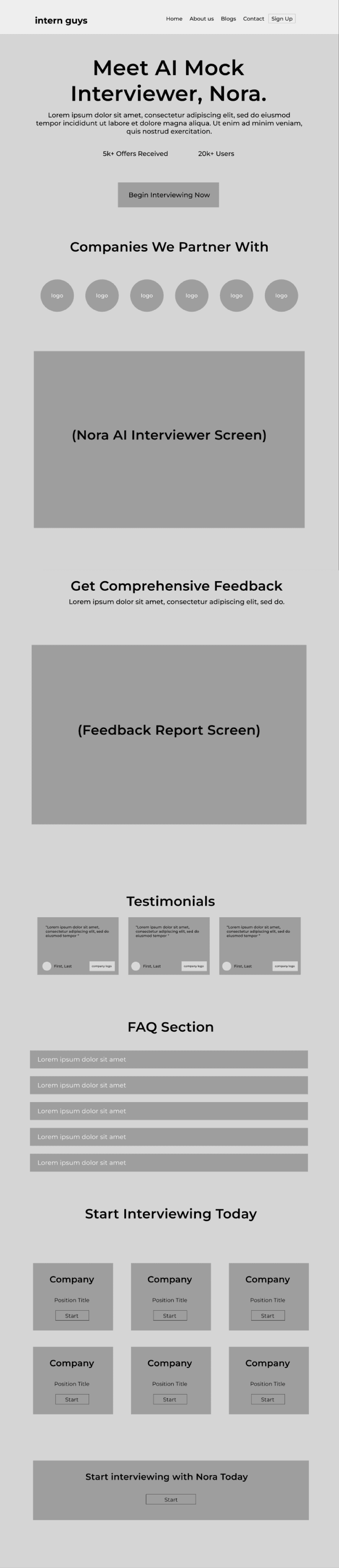
Key Features
Key Features
Key Features
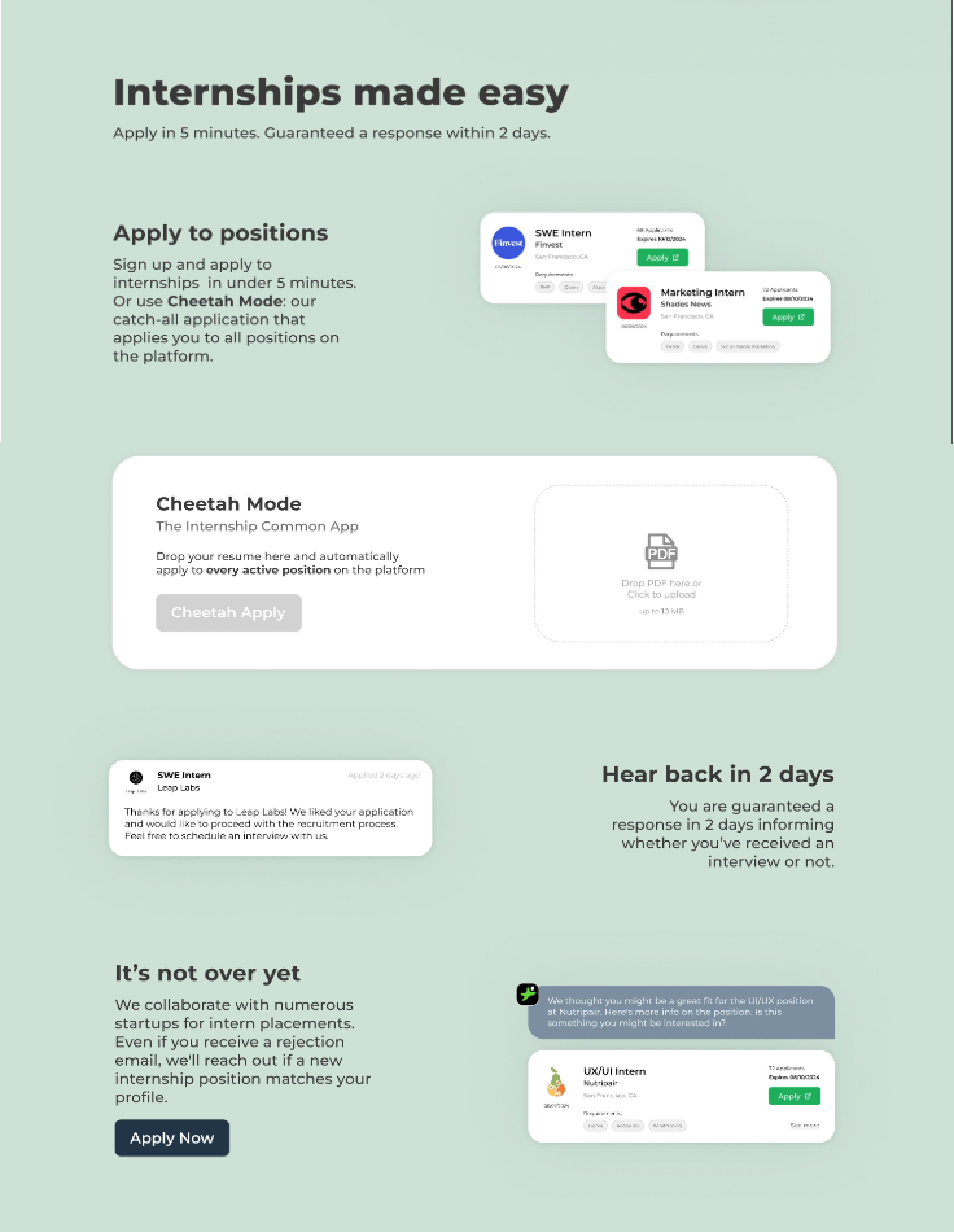
-One clear CTA introducing Nora Mock AI Interviewer
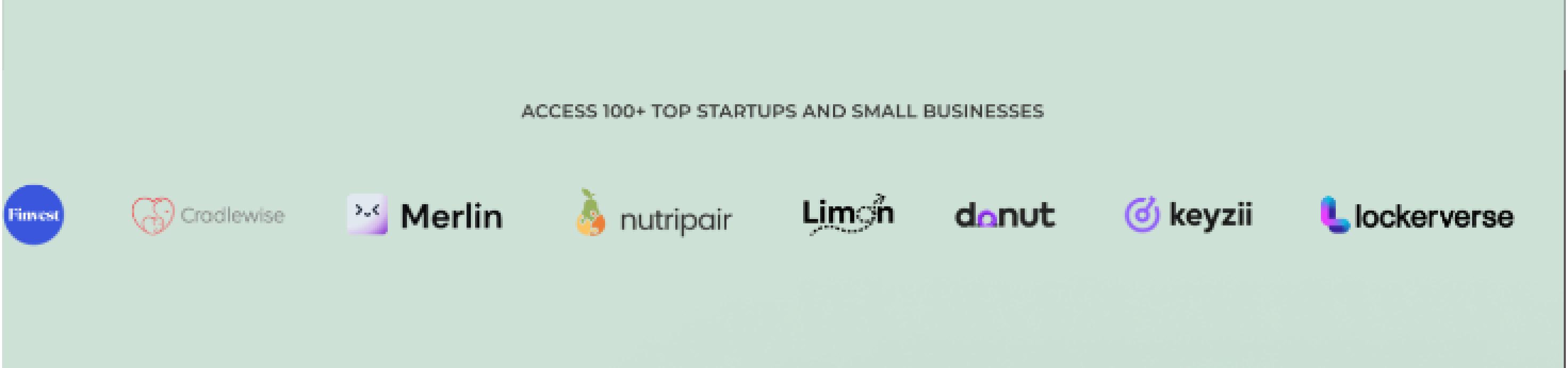
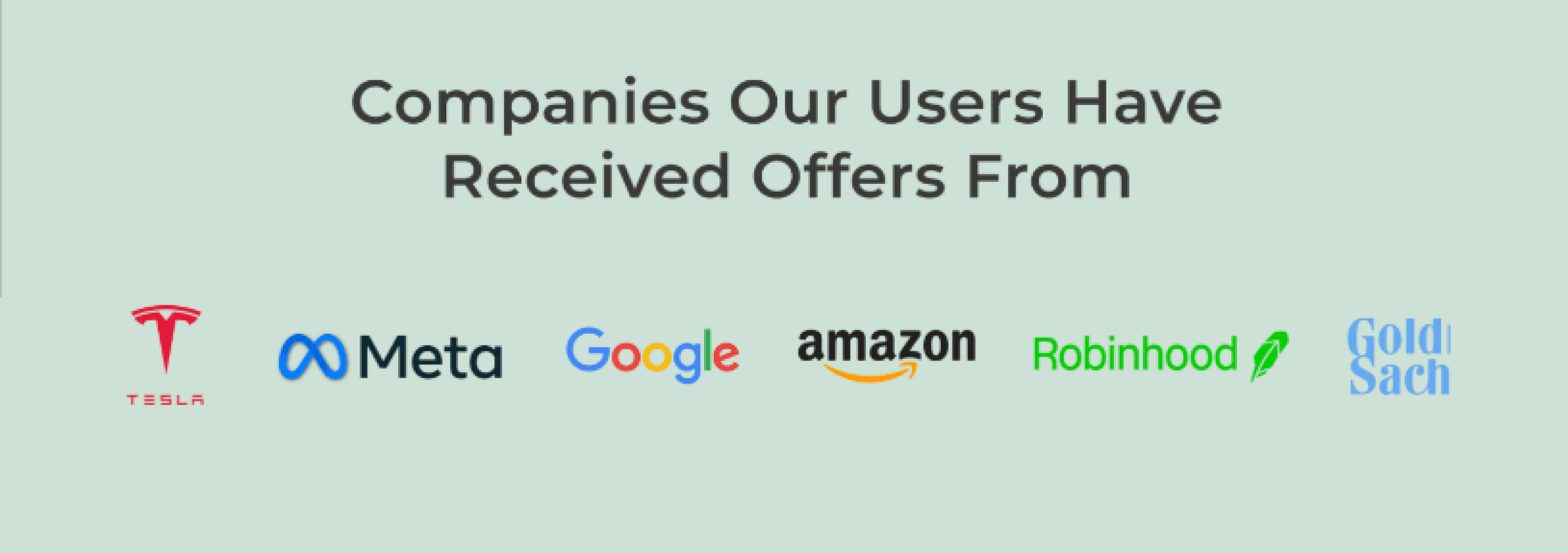
-Updated companies users can interview/receive internship offers from
-Image showing the Mock Interview Screen Feature (emphasis on the live speaking ability)
-Image showing the Feedback Report Screen
-Testimonials
-FAQ
-Start now CTAs
-One clear CTA introducing Nora Mock AI Interviewer
-Updated companies users can interview/receive internship offers from
-Image showing the Mock Interview Screen Feature (emphasis on the live speaking ability)
-Image showing the Feedback Report Screen
-Testimonials
-FAQ
-Start now CTAs
-One clear CTA introducing Nora Mock AI Interviewer
-Updated companies users can interview/receive internship offers from
-Image showing the Mock Interview Screen Feature (emphasis on the live speaking ability)
-Image showing the Feedback Report Screen
-Testimonials
-FAQ
-Start now CTAs
design
design
Design
Finally, time to design!
Finally, time to design!
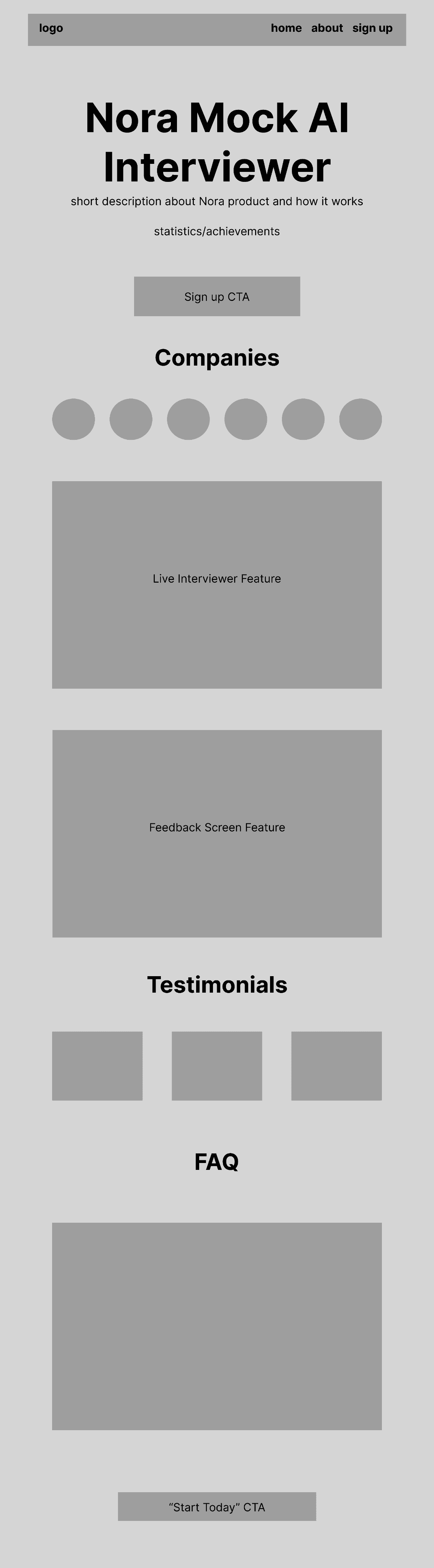
Low-fidelity Wireframes
Low-fidelity Wireframes
Low-fidelity Wireframes
Here are some of the initial wireframes:
Here are some of the initial wireframes:
Here are some of the initial wireframes:
initial draft
initial draft
initial draft
iteration 1
iteration 1
iteration 1
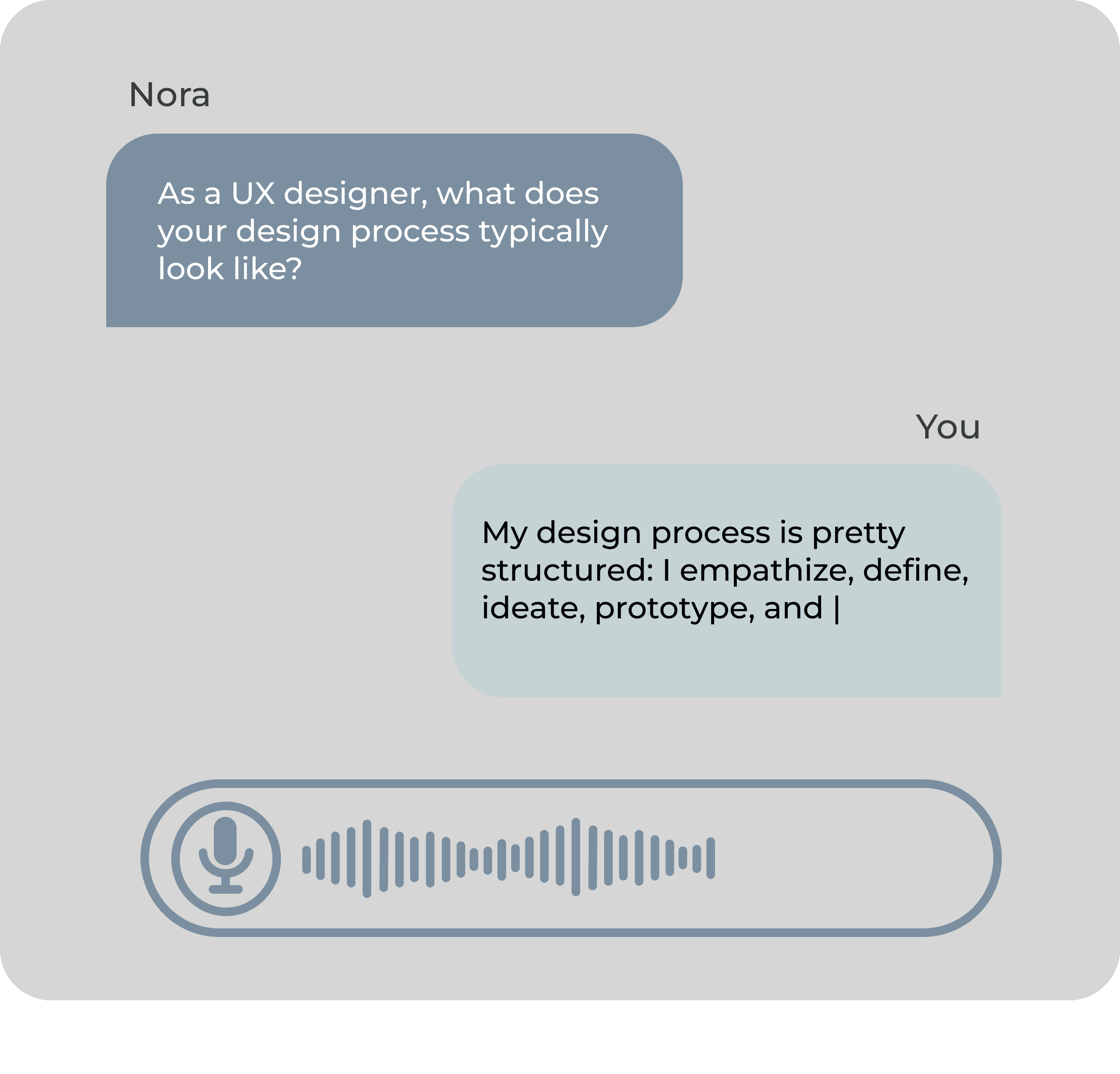
Nora Live Interview Screen
Nora Live Interview Screen
Nora Live Interview Screen
An early dilemma I had was how to best design a feature to showcase the Nora Interviewer to users in a clear and visually pleasing way.
I had two designs: a concise snippet of what the user chatting with Nora would look like, and an entire screen featuring Nora and the user on the left similar to a video chat, with the text-to-speech on the right side.
Text Screen Snippet
Text Screen Snippet
Text Screen Snippet
Full Video-Call Screen (chose this)
Full Video-Call Screen (chose this)
Full Video-Call Screen (chose this)
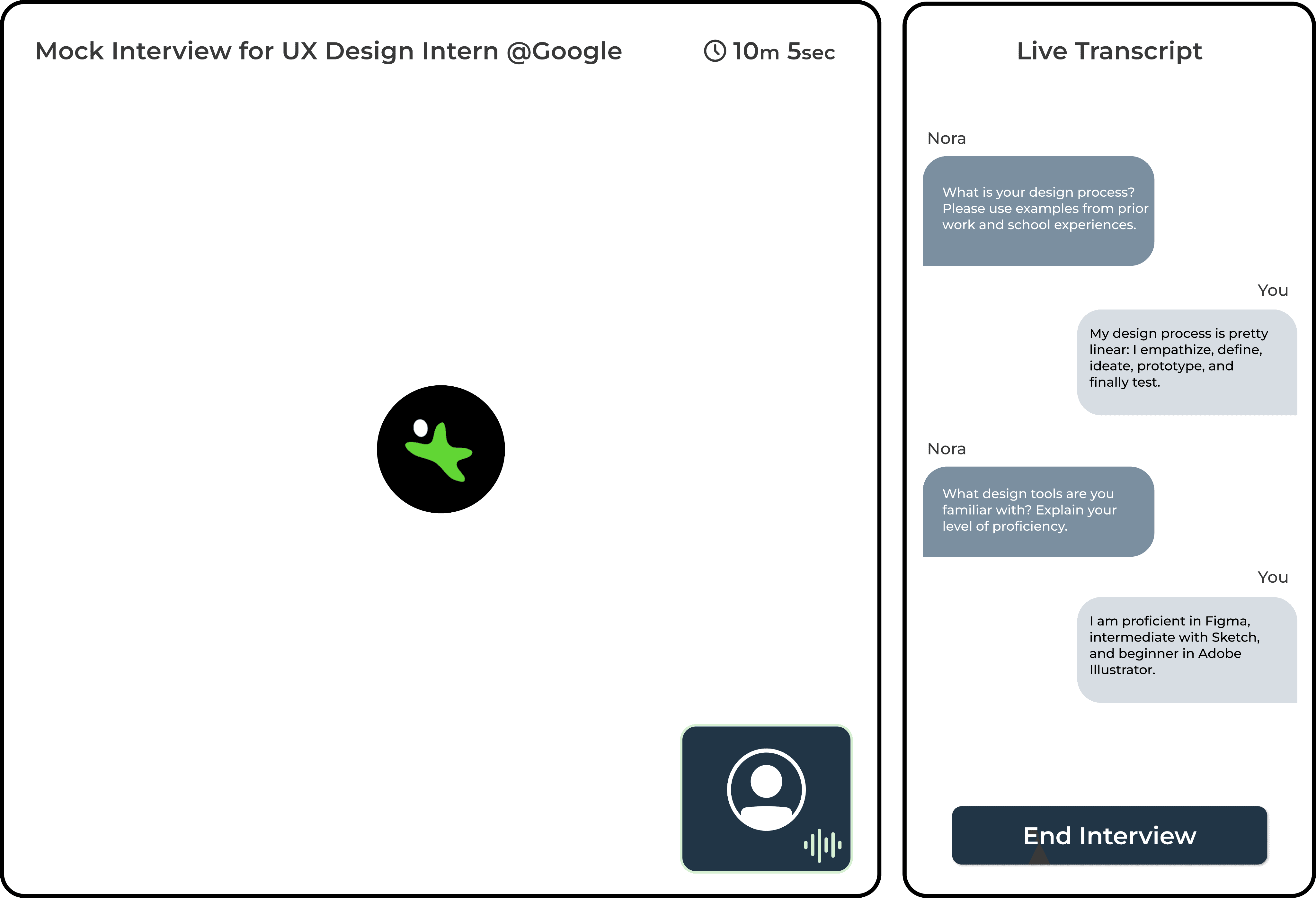
In order to see what actual users would like best we conducted some user tests. Our A/B testing concluded that the design on the right was more effective in showcasing Nora because it was more accurate to how the screen would look, which is what users wanted as opposed to a sneak peek.
In order to see what actual users would like best we conducted some user tests. Our A/B testing concluded that the design on the right was more effective in showcasing Nora because it was more accurate to how the screen would look, which is what users wanted as opposed to a sneak peek.
In order to see what actual users would like best we conducted some user tests. Our A/B testing concluded that the design on the right was more effective in showcasing Nora because it was more accurate to how the screen would look, which is what users wanted as opposed to a sneak peek.
High-fidelity Wireframes (Before vs After)
High-fidelity Wireframes (Before vs After)
High-fidelity Wireframes (Before vs After)
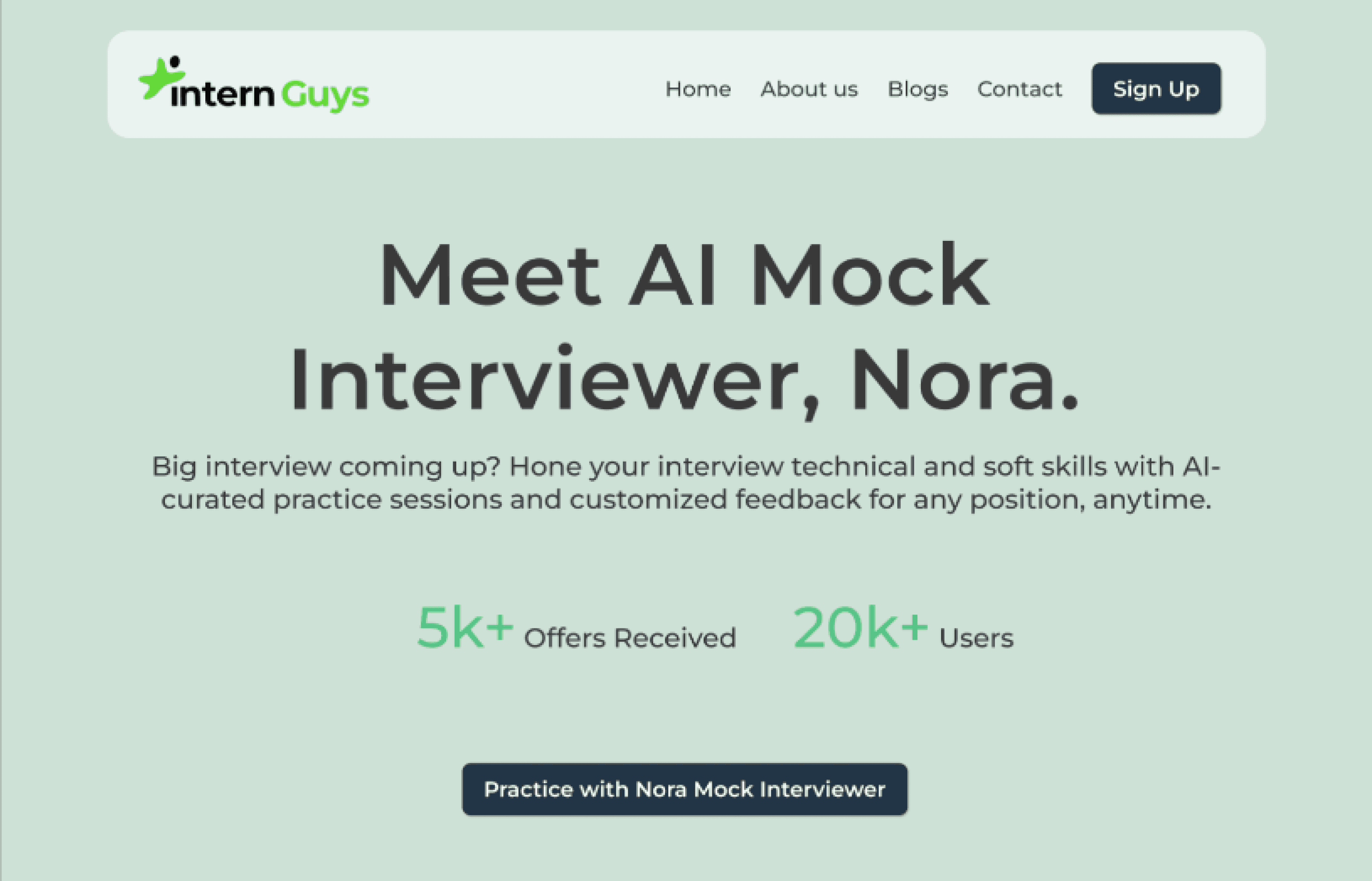
After transforming the low-fidelity into high-fidelity wireframes, here is the comparison of my new homepage with the original homepage for the Intern Guys.
Overall, I updated the design system to make the graphics more consistent throughout the homepage, phased out the old services and implemented the new ones, simplified the navigation bar, and most importantly, made Nora the focus of the homepage. You can see these changes section-by-section below:
Nora AI Header
Nora AI Header
Nora AI Header
Second Header (Confusing)
Second Header (Confusing)
Confusing Second Header
Original Homepage
Original Homepage
Original Homepage
New Homepage
New Homepage
New Homepage
Single Header (Clear)
Single Header (Clear)
Single Header (Clear)
Small Outdated Logos
Small Outdated Logos
Small Outdated Logos
Original Company Logos
Original Company Logos
Original Company Logos
New Company Logos
New Company Logos
New Company Logos
Updated + Enlarged Logos
Updated + Enlarged Logos
Updated + Enlarged Logos
Old Feature
Old Feature
Old
Feature
No Longer Use Cheetah Mode
No Longer Use Cheetah Mode
No Longer Use
Cheetah Mode
Outdated
Outdated
Outdated
Original Feature Graphics
Original Feature Graphics
Original Feature Graphics
New Feature Graphics
New Feature Graphics
New Feature Graphics
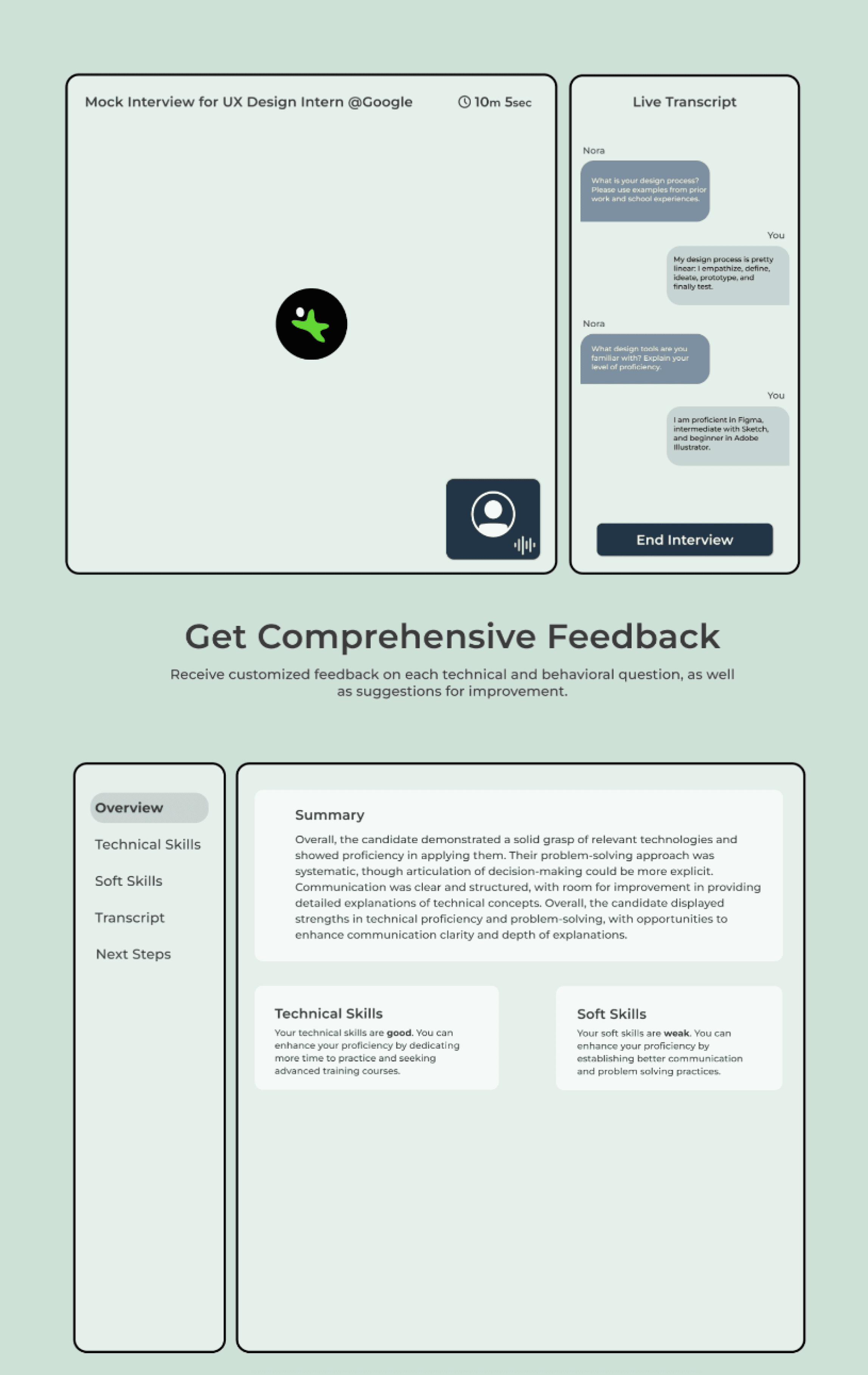
Nora Interview Screen Feature
Nora Interview Screen Feature
Nora Interview Screen Feature
Nora Feedback Report Feature
Nora Feedback Report Feature
Nora Feedback Report Feature
Outdated Testimonials
Outdated Testimonials
Outdated Testimonial
Original Testimonials
Original Testimonials
Original Testimonials
New Testimonials
New Testimonials
New Testimonials
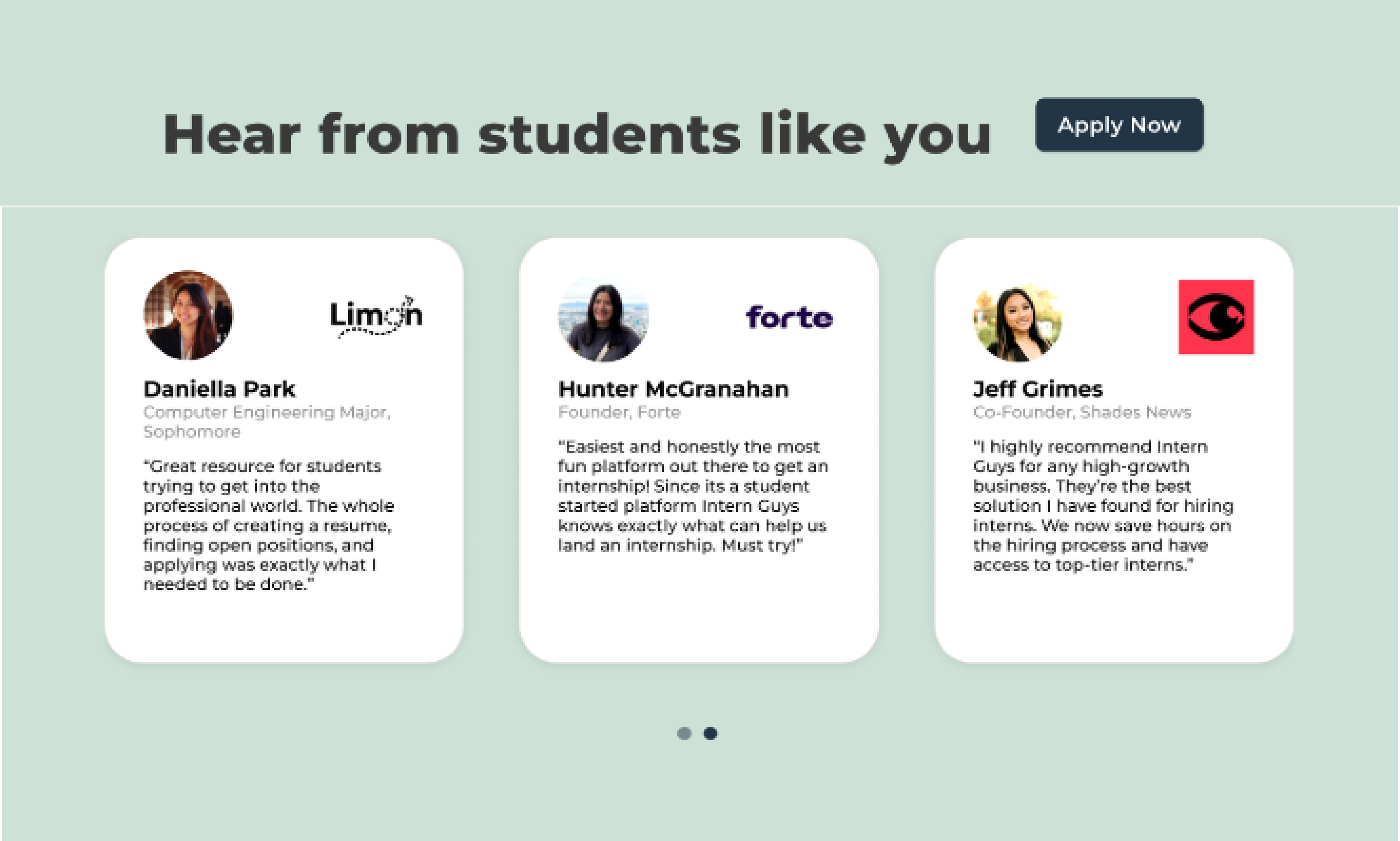
Nora Interviewer Testimonials
Nora Interviewer Testimonials
Nora Interviewer Testimonials
Old positions, no CTAs
Old positions, no CTAs
Old positions no CTAs
Original Positions
Original Positions
Original Positions
New Positions
New Positions
New Positions
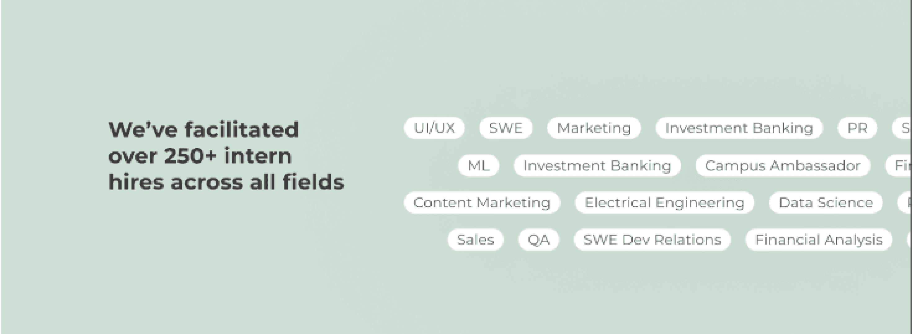
Enlarged positions with logos + CTAs
Enlarged positions with logos + CTAs
Enlarged positions with logos + CTAs
Final CTA
Final CTA
Final CTA
Reflection
Reflect
Resarch
Reflection + What I learned
Reflection + What I learned
Time Management and Making the Deadline
Time Management and Making the Deadline
Time Management and Making the Deadline
I learned that there isn't always time for a fully thought out ideation process from start to finish. With this product being a collaborative effort, I'd be in touch with developers and pushing finished screens to them days or even hours before launch. Therefore, I often adjusted my design process to less steps to make these deadlines, hence why I don't have several low-fidelity wireframes. I feel that I've become a more efficient designer who can work under many conditions.
I learned that there isn't always time for a fully thought out ideation process from start to finish. With this product being a collaborative effort, I'd be in touch with developers and pushing finished screens to them days or even hours before launch. Therefore, I often adjusted my design process to less steps to make these deadlines, hence why I don't have several low-fidelity wireframes. I feel that I've become a more efficient designer who can work under many conditions.
I learned that there isn't always time for a fully thought out ideation process from start to finish. With this product being a collaborative effort, I'd be in touch with developers and pushing finished screens to them days or even hours before launch. Therefore, I often adjusted my design process to less steps to make these deadlines, hence why I don't have several low-fidelity wireframes. I feel that I've become a more efficient designer who can work under many conditions.
Never Underestimate the User
Never Underestimate the User
Never Underestimate the User
It's obvious that the user is important, however, at times during this project I found myself being initially confident with certain features or screens. Being a college student applying for internships myself, I think I gave myself too much credit with regards to knowing my audience. However, when conducting usability tests after pushing these features, I found a lot of critiques and constructive feedback that proved really valuable to improving the final product. User testing saved me from potentially wasting effort on features students wouldn't even enjoy.
It's obvious that the user is important, however, at times during this project I found myself being initially confident with certain features or screens. Being a college student applying for internships myself, I think I gave myself too much credit with regards to knowing my audience. However, when conducting usability tests after pushing these features, I found a lot of critiques and constructive feedback that proved really valuable to improving the final product. User testing saved me from potentially wasting effort on features students wouldn't even enjoy.
It's obvious that the user is important, however, at times during this project I found myself being initially confident with certain features or screens. Being a college student applying for internships myself, I think I gave myself too much credit with regards to knowing my audience. However, when conducting usability tests after pushing these features, I found a lot of critiques and constructive feedback that proved really valuable to improving the final product. User testing saved me from potentially wasting effort on features students wouldn't even enjoy.
Nora Technical Slider
Nora Technical Slider
Nora Technical Slider
overview
overview
Overview
Users needed a way to adjust the technicality of their interviews
Users needed a way to adjust the technicality of their interviews
Users needed a way to adjust the technicality of their interviews
Nora's features are now all nearly complete, except for a couple small tweaks. Before a user begins an interview, I need to design a feature that allows them to customize how many technical questions will be asked. My goal is to create an easy-to-use slider feature that lets users adjust their interview's technicality.
Nora's features are now all nearly complete, except for a couple small tweaks. Before a user begins an interview, I need to design a feature that allows them to customize how many technical questions will be asked. My goal is to create an easy-to-use slider feature that lets users adjust their interview's technicality.
Nora's features are now all nearly complete, except for a couple small tweaks. Before a user begins an interview, I need to design a feature that allows them to customize how many technical questions will be asked. My goal is to create an easy-to-use slider feature that lets users adjust their interview's technicality.
Original
Original
Technical Slider Iterations
Technical Slider Iterations
Technical Slider Iterations
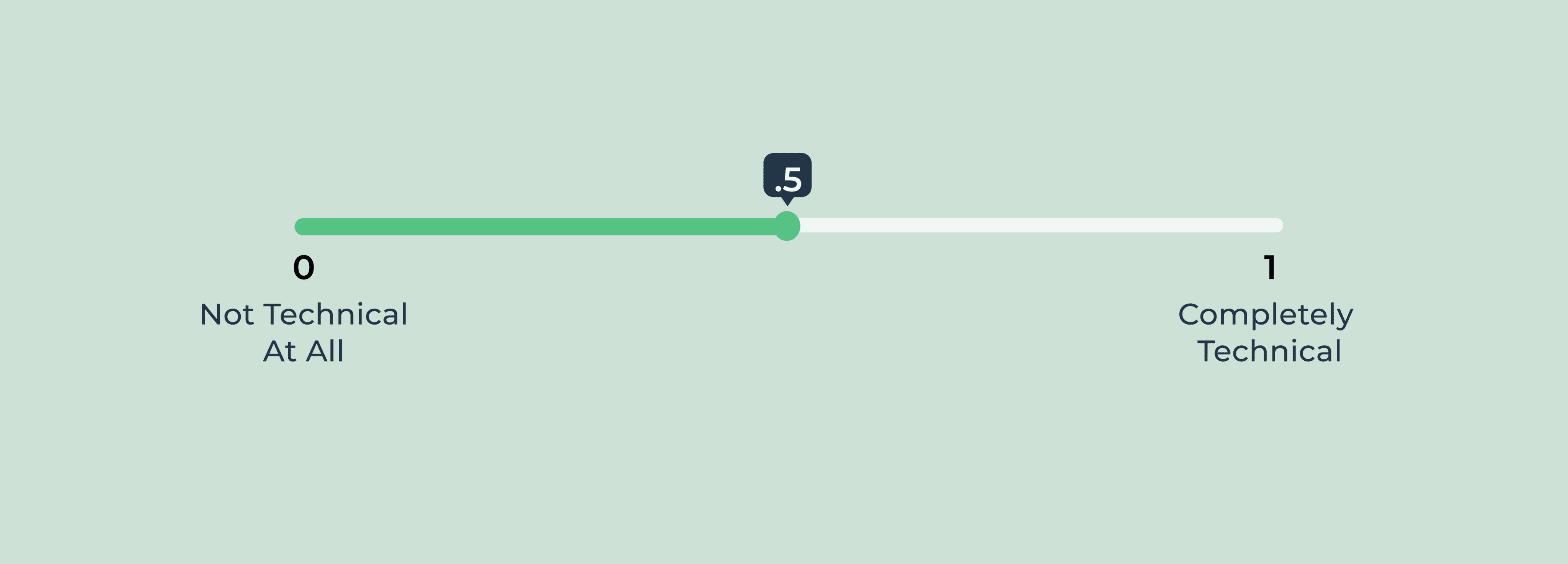
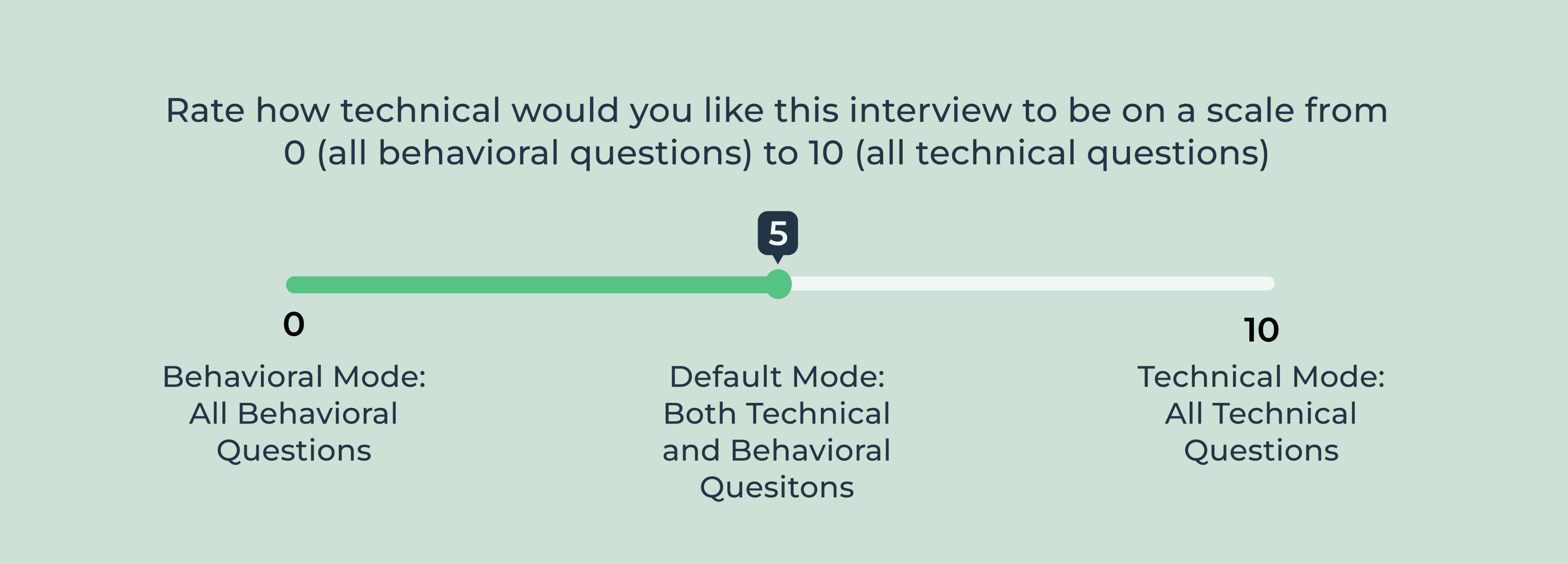
I drafted two iterations for the technical slider, one on a scale of 0-1 and another on a scale of 1-10 with different wordings to explain the feature.
After conducting A/B testing with some sample users, I found that more users were better understanding the point of the technical slider with the more thorough explanation from the right design, so I ended up going with that one.I believe it was more successful because it also explained the default mode, which resembled a normal interview which would ask a random mix of behavioral and technical questions.
Iteration 1 (0-1)
Iteration 1 (0-1)
Iteration 1 (0-1)
Iteration 2 (0-10)
Iteration 2 (0-10)
Iteration 2 (0-10)
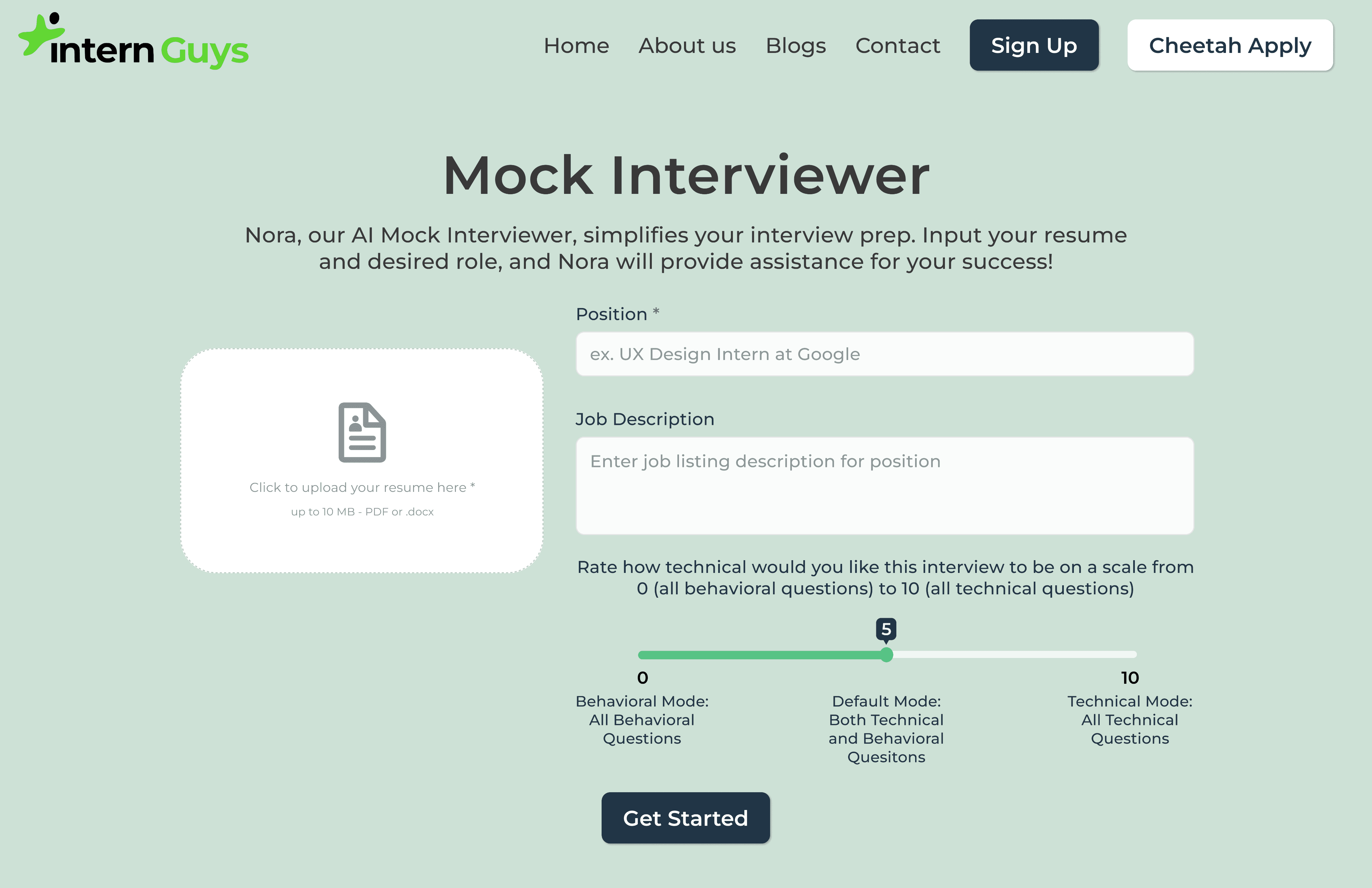
Final Version with Slider
Final Version with Slider
Final Version with Slider
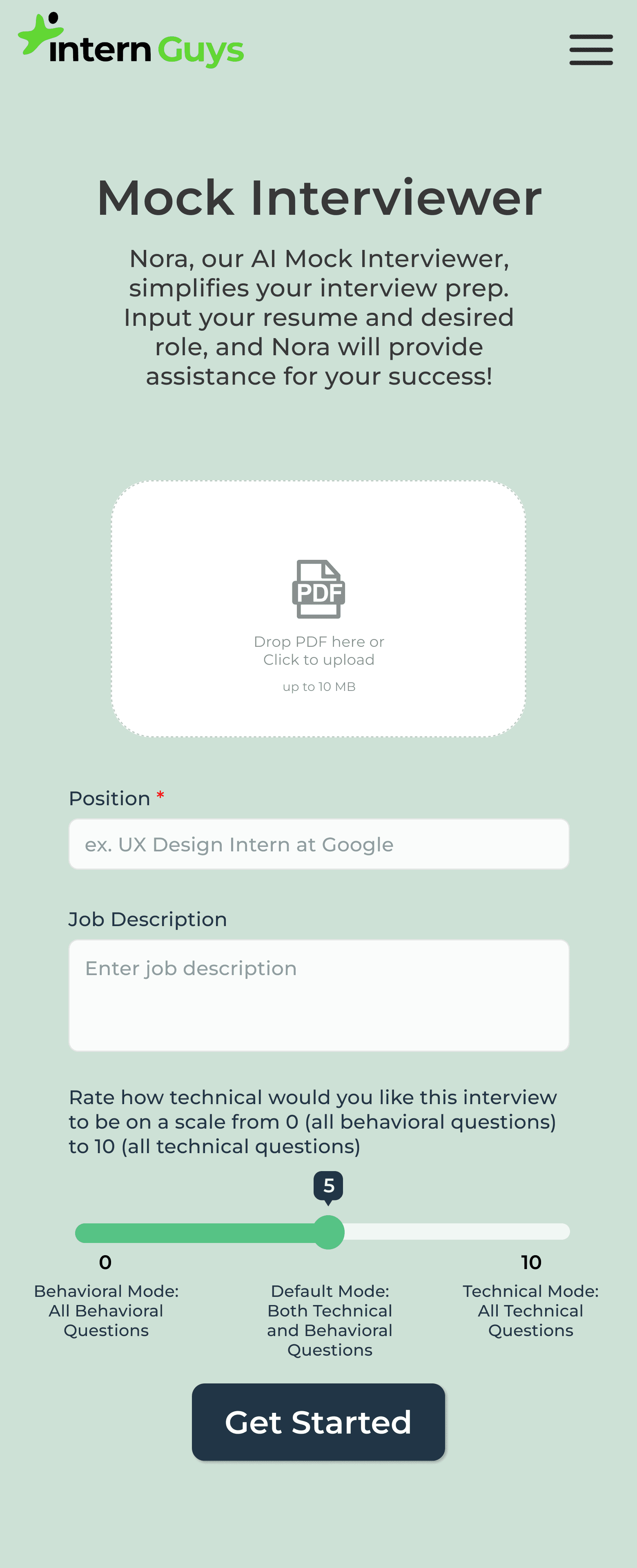
Final Mobile Version
Mobile
Final Mobile Version
Reflection
Reflection
Reflection
This was one of my first projects with the Intern Guys and was a great opportunity to get used to figuring out my design process and handing off to developers. From this project I realized how much creative freedom I got on my projects, within the bounds of the requirements of course, and became more excited for future projects and chances to refine my design process!
This was one of my first projects with the Intern Guys and was a great opportunity to get used to figuring out my design process and handing off to developers. From this project I realized how much creative freedom I got on my projects, within the bounds of the requirements of course, and became more excited for future projects and chances to refine my design process!
This was one of my first projects with the Intern Guys and was a great opportunity to get used to figuring out my design process and handing off to developers. From this project I realized how much creative freedom I got on my projects, within the bounds of the requirements of course, and became more excited for future projects and chances to refine my design process!
Payment Screens
Payment Screens
Payment Screens
overview
overview
Overview
Designing a way for users to pay
Designing a way for users to pay
Designing a way for users to pay
The Intern Guys' current payment page was through a third party site, and they were in need of a payment screen that was internal to their own website with their style guide. I was also responsible for creating success and failure screens after the user attempts to make a payment.
The Intern Guys' current payment page was through a third party site, and they were in need of a payment screen that was internal to their own website with their style guide. I was also responsible for creating success and failure screens after the user attempts to make a payment.
The Intern Guys' current payment page was through a third party site, and they were in need of a payment screen that was internal to their own website with their style guide. I was also responsible for creating success and failure screens after the user attempts to make a payment.
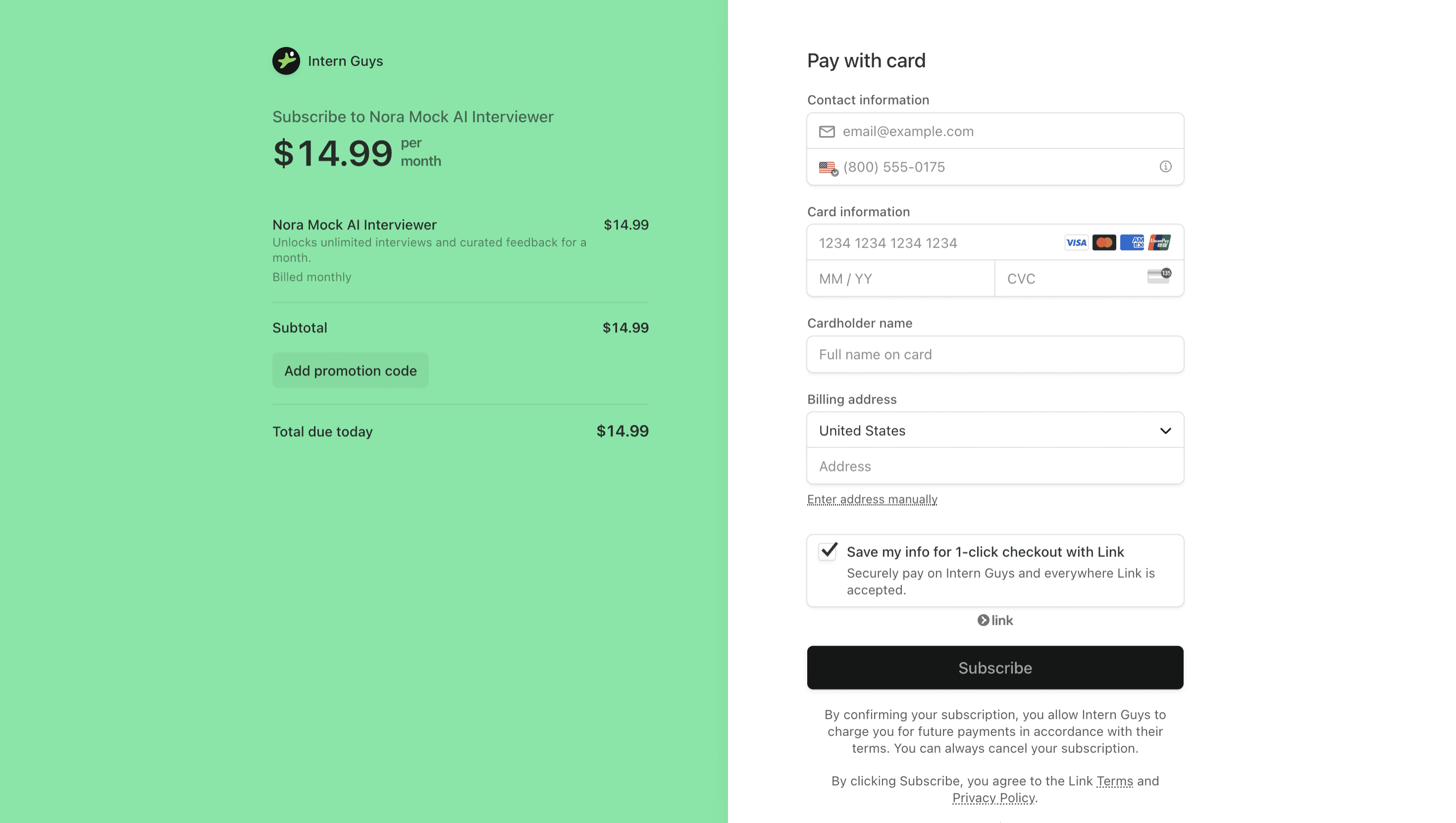
Original
Original
Newly Redesigned Payment Screens
Newly Redesigned Payment Screens
Newly Redesigned Payment Screens
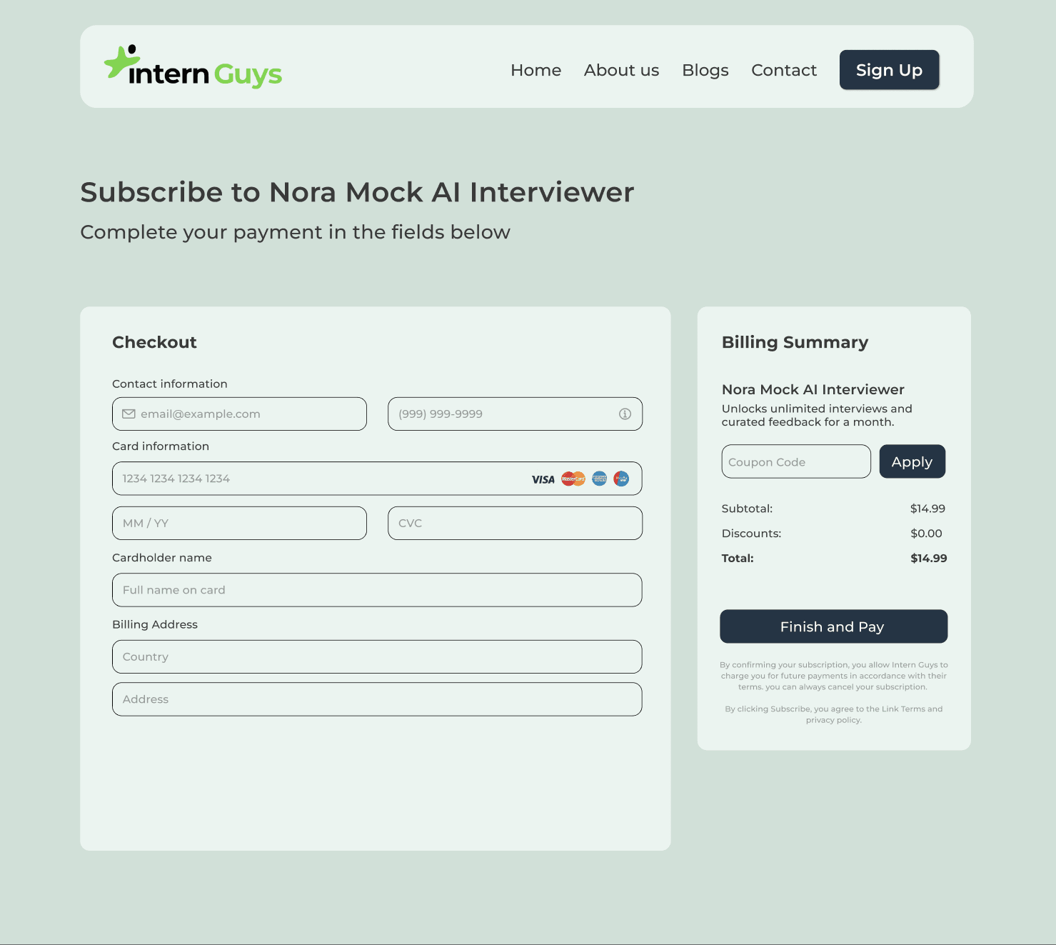
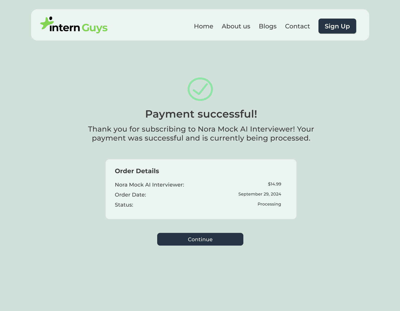
I designed 3 new screens to create a complete payment user flow for the Intern Guys Page. This includes a screen for the user to enter their payment information, a screen that confirms the user's successful payment, and a screen that lets the user know their payment failed.
I designed 3 new screens to create a complete payment user flow for the Intern Guys Page. This includes a screen for the user to enter their payment information, a screen that confirms the user's successful payment, and a screen that lets the user know their payment failed.
I designed 3 new screens to create a complete payment user flow for the Intern Guys Page. This includes a screen for the user to enter their payment information, a screen that confirms the user's successful payment, and a screen that lets the user know their payment failed.
Payment Information Screen
Payment Information Screen
Payment Information Screen
Internal payment page that maintains Intern Guys' design system
Internal payment page that maintains Intern Guys' design system
Internal payment page that maintains Intern Guys' design system
Payment Success Screen
Payment Success Screen
Payment Success Screen
Clear design and text signals user that they payment successfully went through
Clear design and text signals user that they payment successfully went through
Clear design and text signals user that they payment successfully went through
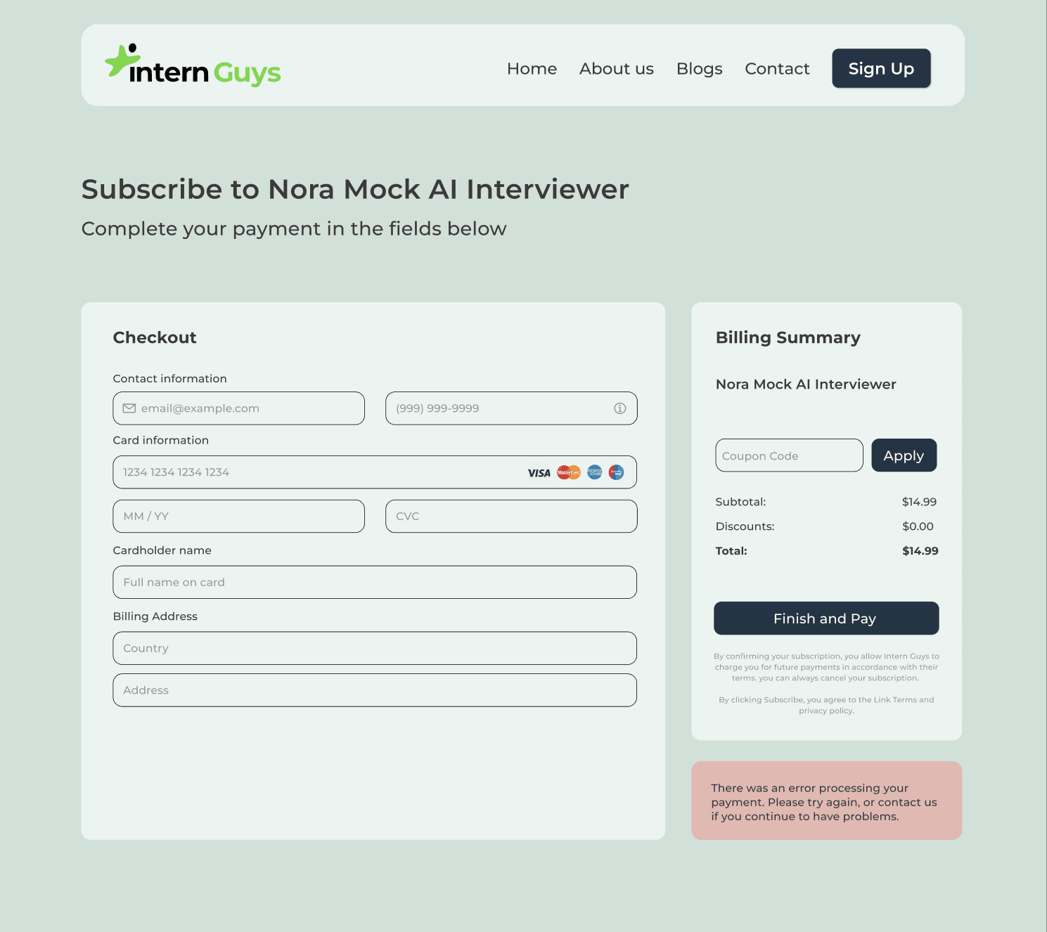
Payment Failure Screen
Payment Failure Screen
Payment Failure Screen
Design that signals to the user that their payment failed to go through and to fill in their information again
Design that signals to the user that their payment failed to go through and to fill in their information again
Design that signals to the user that their payment failed to go through and to fill in their information again